 Haplo
Haplo
Bollinger Bands Explained
Three lines that show whether a price is high or low compared with its own recent past. We work the formula through real AMD prices, explain %b, BandWidth and the squeeze, and check what studies of band trading found.

Bollinger Bands are three lines drawn around a stock’s price: a 20-day average in the middle, and a band above and below it that widens when prices swing hard and narrows when they go quiet. They show whether a price is high or low compared with its own recent past. We make Haplo AI Investing, an iPhone stock research app that draws Bollinger Bands on its charts, reads them in plain words and scores them, so we also show how the app reads them.
This is education, not investment advice. Nothing here recommends buying, selling or holding anything, and the AMD prices are historical examples, not a forecast.
What are Bollinger Bands?
When John Bollinger started working in the markets full time in 1980, traders used bands set a fixed percentage above and below a moving average. Bollinger’s history of the bands explains the problem: those bands had to be adjusted over time, and the adjusting let emotions in. Bollinger’s fix was to set the width with standard deviation, a measure of how spread out recent prices are, so the bands adapt as volatility changes.
The first of Bollinger’s 22 rules says what they do: “By definition price is high at the upper band and low at the lower band.” That’s high compared with the last 20 days. It doesn’t make a stock expensive, and it isn’t a signal to sell.
How Bollinger Bands are calculated
The standard settings, written Bollinger Bands (20, 2), use 20 periods and 2 standard deviations. On a daily chart:
- Middle band: the 20-day simple moving average of closing prices.
- Upper band: the middle band plus 2 standard deviations of the same 20 closes.
- Lower band: the middle band minus 2 standard deviations.
That’s the formula in StockCharts’ ChartSchool and Fidelity’s guide. One detail trips up spreadsheets: Bollinger uses the population standard deviation, which divides by 20, not the sample version, which divides by 19. Haplo AI Investing’s code does the same. For a refresher on moving averages, see how to read a stock chart.
Worked example: AMD in September 2026
AMD’s bands on two dates, from its daily closes on Nasdaq:
| Sep 1, 2026 | Sep 25, 2026 | |
|---|---|---|
| Close | $459.61 | $630.63 |
| 20-day average (middle band) | $478.39 | $528.10 |
| Standard deviation of the 20 closes | $13.59 | $60.95 |
| Two standard deviations | $27.17 | $121.90 |
| Upper band | $505.56 | $650.00 |
| Lower band | $451.22 | $406.20 |
| Gap between the bands | $54.34 | $243.80 |
| BandWidth (gap ÷ middle band) | 11.4% | 46.2% |
| %b (where the close sits) | 0.15 | 0.92 |
In three and a half weeks the standard deviation of AMD’s last 20 closes rose from $13.59 to $60.95, and the gap between the bands grew almost four and a half times. The bands stretch when prices move and shrink when they don’t.
Why two standard deviations doesn’t mean 95 percent
On a bell curve, about 95 percent of values fall within two standard deviations of the average. Prices don’t follow one, and Bollinger’s rules say: “In practice we typically find 90%, not 95%, of the data inside Bollinger Bands with the default parameters.”
On the S&P 500’s daily closes from FRED, October 2016 to September 2026, 89.1 percent of closes landed inside the bands, 6.0 percent above and 4.9 percent below; for AMD since July 2024, 85.6 percent landed inside. A close outside the bands happens roughly one day in ten.
How to read Bollinger Bands
1. Check the width: BandWidth
BandWidth is the gap between the bands divided by the middle band, usually shown as a percentage. Falling BandWidth means volatility is shrinking, StockCharts notes, and rising BandWidth means it’s growing.
It only means something against the same stock’s history. Over the past year AMD’s BandWidth ran from 7.9 to 70.8 percent, with a middle value of 24.0 percent. The S&P 500’s middle value over ten years was 5.2 percent, and AMD’s narrowest bands of the year were wider than the index’s on 79 percent of days in that decade.
2. Find the price: %b
%b puts the close on a scale where 0 is the lower band and 1 is the upper band:
%b = (price − lower band) ÷ (upper band − lower band)
A reading of 0.5 is the middle band, above 1 is a close above the upper band, and below 0 is a close below the lower band, as StockCharts’ %B guide sets out. AMD’s 0.92 on September 25 put it near the top of its bands, still inside.
3. Read the trend first
The middle band’s slope shows the short-term trend. In a strong uptrend, StockCharts notes, prices can “walk up the upper band and rarely touch the lower band,” so a dip to the lower band means something different in an uptrend than in a downtrend.
4. Treat touches as tags, not signals
Bollinger’s sixth rule: “A tag of the upper Bollinger Band is NOT in-and-of-itself a sell signal. A tag of the lower Bollinger Band is NOT in-and-of-itself a buy signal.” The rules suggest judging tags against an indicator instead, and if you use more than one, picking ones that aren’t directly related: “two momentum indicators aren’t better than one.” RSI or MACD can fill the momentum role; pick one rather than stacking both.
The Bollinger Band squeeze
A squeeze is a stretch when the bands pull tight because prices have gone quiet. StockCharts’ version looks for BandWidth “near the low end of its six-month range,” then waits for the price to break out of a band.
It rests on a real feature of markets: volatility comes in spells. The announcement of Robert Engle’s 2003 Nobel prize, for work on changing volatility, notes that “turbulent periods with large fluctuations are followed by calmer periods with small fluctuations.” A squeeze bets that calm won’t last, though the prize’s longer explainer notes that small changes also tend to be followed by small ones.
Narrowing bands “do not provide any directional clues,” StockCharts warns, and, citing Bollinger’s book, it flags the head fake, when prices “break a band, then suddenly reverse and move the other way.”
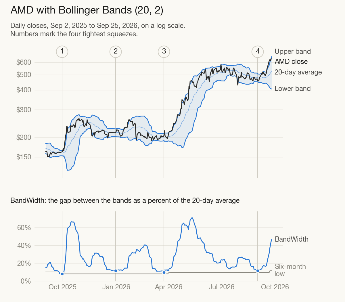
AMD’s four squeezes in the past year
These are illustrations from one stock in one year, not evidence for a rule.
| Squeeze | Narrowest BandWidth | Price in the bands | What came next |
|---|---|---|---|
| 1. Late Sep 2025 | 7.9%, a six-month low | Upper half | Up 23.7% on Oct 6, when AMD announced a GPU deal with OpenAI. $264.33 by Oct 29 |
| 2. Late Dec 2025 | 11.5% | Middle | Above the upper band on Jan 16 and up to $259.68 by Jan 23, then down 17.3% on Feb 4 to $200.19, below the squeeze’s lower band |
| 3. Mar 2026 | 9.5% | Upper half | Head fake: above the upper band at $220.27 on Mar 25, back to $203.77 the next day. The lasting break came Apr 2, and the price more than doubled by May 11 |
| 4. Late Aug 2026 | 11.4% | Near the lower band | Broke upward anyway: above the upper band on Sep 9, $630.63 by Sep 25 |
Each squeeze was followed by bigger moves, but nothing in it said which way. All four broke upward first in a year when AMD nearly quadrupled, which says more about the trend than about squeezes, and the second gave it all back within three weeks.
Walking the bands
Two of Bollinger’s rules matter here: “In trending markets price can, and does, walk up the upper Bollinger Band and down the lower Bollinger Band,” and “Closes outside the Bollinger Bands are initially continuation signals, not reversal signals.”
AMD’s spring 2026 is a textbook walk. From April 2 to May 11 it closed above the upper band on 15 of 27 trading days, never closed below the middle band, and went from $217.50 to $458.79, up 111 percent. Every one of those 15 closes looked stretched.
October 2025 shows both sides. On October 6, AMD closed so far above its upper band that %b read 1.54. It climbed for three more weeks, to $264.33, then cooled, closing at $198.11 on December 17, below its October 6 close of $203.71. “Stretched” was right; the bands just couldn’t say when.
The warning sign Bollinger looks for at a top, as StockCharts describes it: a high above the upper band, a pullback toward the middle, then a new price high that fails to reach the upper band.
Do Bollinger Bands work? What the research says
Tests of the bands as trading rules have found little that survives trading costs, and less since they became popular.
- Technical analysis overall. Park and Irwin (2007) reviewed 95 modern studies: 56 found positive results, 20 negative and 19 mixed, but most had problems such as data snooping, choosing rules after the fact, and hard-to-estimate risk and trading costs.
- Moving-average rules. Brock, Lakonishok and LeBaron (1992) found strong support for simple moving-average and trading-range rules on the Dow from 1897 to 1986. Revisiting technical rules on the Dow through 2011, Bajgrowicz and Scaillet (2012) found an investor “would never have been able to select ex ante the future best-performing rules,” and low transaction costs wiped out even the in-sample gains.
- Bands against envelopes. Leung and Chong (2003) found Bollinger Bands did not outperform moving average envelopes, the fixed-percentage bands they replaced.
- Against buy-and-hold. Lento, Gradojevic and Wright (2007) found that after transaction costs the bands were “consistently unable to earn profits in excess of the buy-and-hold trading strategy,” though a contrarian version did better.
- Popularity. Fang, Jacobsen and Qin (2017) found that trading on the bands would have been “very profitable” before their 1983 debut. Afterwards their predictive power gradually fell, and it has “largely disappeared in most international markets since 2001,” when Bollinger’s book on them came out.
The bands measure volatility and relative price accurately. The evidence is against using a touch as a standalone trigger, which the rules don’t claim it is: the bands “do not provide continuous advice; rather they help identify setups where the odds may be in your favor.”
How Haplo AI Investing reads Bollinger Bands
The app uses the bands, calculated Bollinger’s way, in two places.
On the Technical Analysis page
- Open a stock and tap Advanced on its price chart.
- Tap the Bollinger chip (it starts off). The bands appear as three cyan lines.
- Pick 1Y or 5Y, which use daily closes. Shorter views use intraday prices, so the bands cover far less time.
- Scroll to What the indicators say.
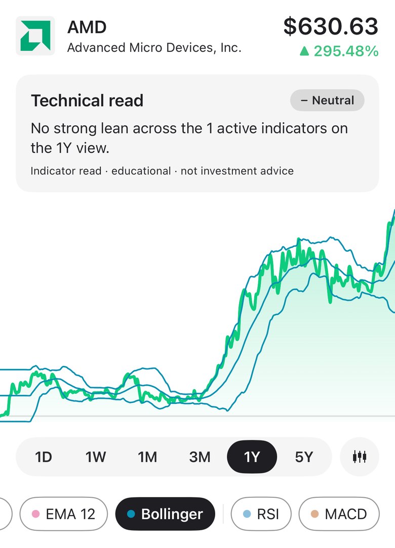
The read gives BandWidth (for example “11.4% wide”), a lean and a sentence:
- Above the upper band, bearish: “Price is riding above the upper band, a strong but stretched move that often cools off.”
- Below the lower band, bullish: “Price is below the lower band, an unusually deep dip that often snaps back.”
- Inside, neutral: “Price is inside the bands, volatility is not at an extreme.”
When BandWidth is under 75 percent of its average over the previous 20 bars, the read adds: “The bands are also tightening, a bigger move often follows a squeeze.” Each lean counts toward the “Technical read” card at the top of the page.
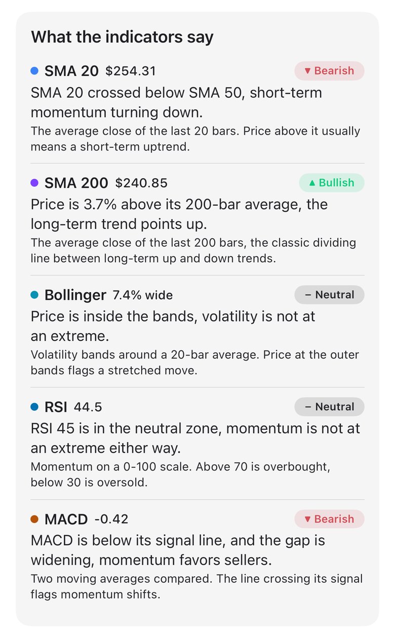
Two things to know. The bearish lean above the upper band is the textbook “stretched” read, while Bollinger’s rules treat those closes as continuation signals at first: during AMD’s spring walk it would have leaned bearish on 15 days while the price doubled. Read it as “stretched,” not “about to fall.” And because the squeeze note looks back only 20 bars, it’s looser than a six-month low. Checked daily from September 2025 to September 2026, it would have shown for AMD in seven stretches, one of them while the bands were still 20 to 45 percent wide; only the September 2025 squeeze was a six-month low.
In the setup score: Stretch
The setup score, a 0 to 100 read of a stock’s daily closes, appears under Technical scores on the Today screen for your watchlist stocks, with an ⓘ that shows each part’s value and score. The parts are weighted Trend 30 percent, Momentum 25, MACD 20, Strength 15 and Stretch 10. Stretch scores the latest close’s %b in Bollinger Bands (20, 2):
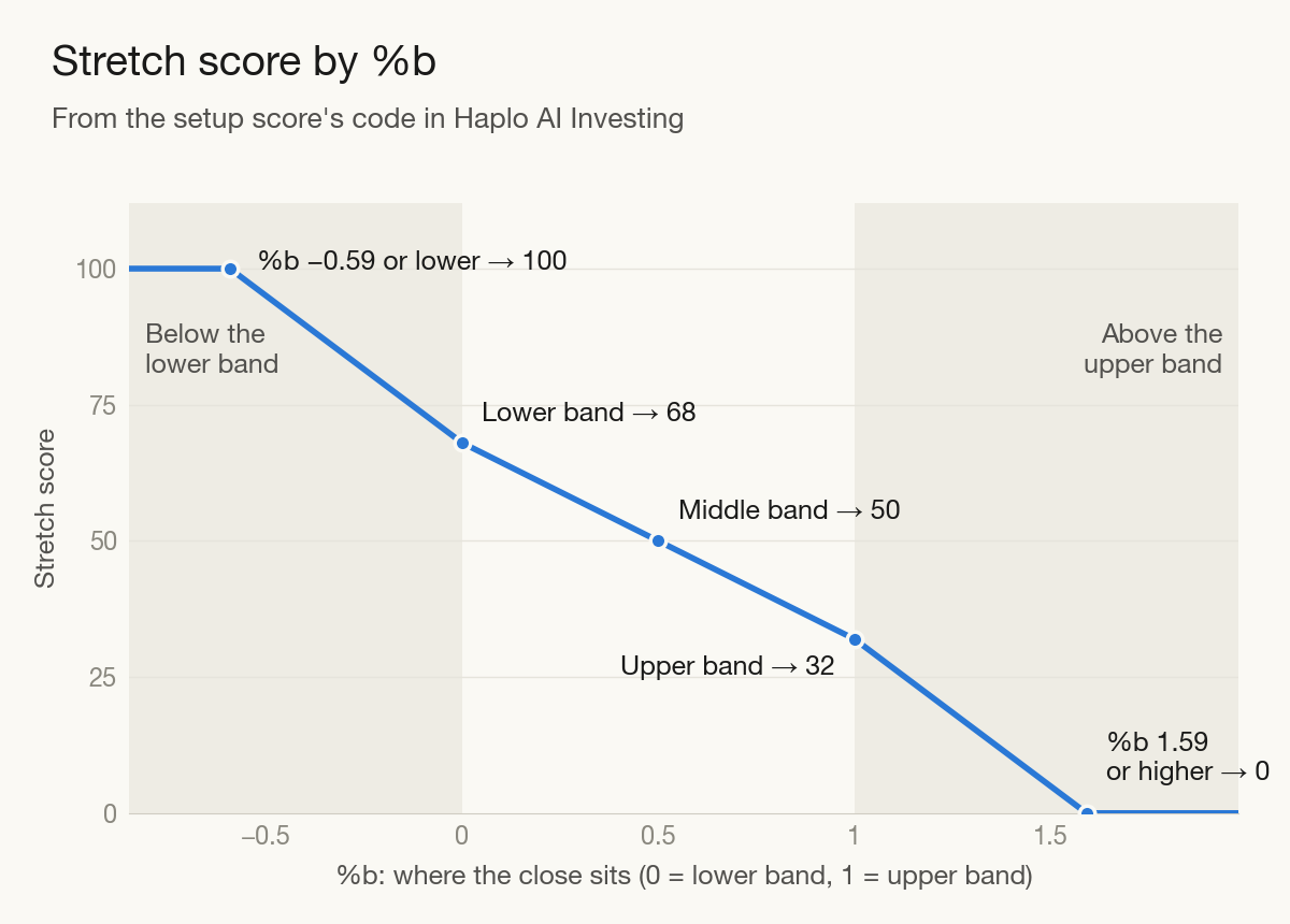
Inside the bands the score slides from 68 at the lower band to 32 at the upper. Beyond them it moves 5.4 points for every 0.1 of %b, reaching 0 at 1.59 and 100 at −0.59. AMD’s September 25 close (%b 0.92) scores 35; the October 6, 2025 jump (1.54) scored 3.
Inside the bands, Stretch can move the overall score by at most 3.6 points, and never by more than 10. The code calls it “a modifier, not a driver,” and says the Strength part, which rewards a price near the top of its yearly range, balances it so “a leader at highs isn’t punished twice.” Every screen with these reads and scores is labelled “educational · not investment advice.”
Bollinger Bands FAQ
Is touching the upper Bollinger Band a sell signal?
No. Bollinger’s rules say a tag of the upper band “is NOT in-and-of-itself a sell signal,” and closes outside the bands are initially continuation signals. AMD closed above its upper band 15 times in spring 2026 while it doubled.
What are the best Bollinger Band settings?
There isn’t a best one. Bollinger calls 20 and 2 “just that, defaults,” and suggests 1.9 standard deviations for 10 periods and 2.1 for 50, to keep a similar share of prices inside.
Why do my Bollinger Bands look different in another app?
Usually it’s the standard deviation. A tool that divides by 19 instead of 20 draws bands about 2.6 percent wider; on the S&P 500, that raised the share of closes inside from 89.1 to 90.7 percent in our data. A different period, width or price data (intraday instead of daily) changes them too.
How we made this
AMD’s prices are daily closes from Nasdaq’s historical quotes, June 2024 to September 25, 2026; the S&P 500’s are FRED’s, from September 2016. We calculated the bands with a 20-close average and the population standard deviation, as the app’s source code does, and numbered AMD’s four tightest BandWidth stretches of the year as its squeezes. We ran no backtests: the examples show how the bands behaved, not how a strategy would have done. Research findings come from each paper’s abstract, and the app details from its code. The charts are ours; the photo is from Wikimedia Commons.
References
- Bollinger J. Bollinger Bands and Bollinger Band Rules. BollingerBands.com.
- StockCharts ChartSchool. Bollinger Bands, %B Indicator, Bollinger BandWidth and Bollinger Band Squeeze.
- Fidelity Learning Center. Bollinger Bands. Technical Indicator Guide.
- The Royal Swedish Academy of Sciences. The Prize in Economic Sciences 2003: press release and popular information. NobelPrize.org.
- Park C-H, Irwin SH. What Do We Know About the Profitability of Technical Analysis? Journal of Economic Surveys. 2007;21(4):786-826.
- Brock W, Lakonishok J, LeBaron B. Simple Technical Trading Rules and the Stochastic Properties of Stock Returns. Journal of Finance. 1992;47(5):1731-1764.
- Bajgrowicz P, Scaillet O. Technical trading revisited: False discoveries, persistence tests, and transaction costs. Journal of Financial Economics. 2012;106(3):473-491.
- Leung JM-J, Chong TT-L. An empirical comparison of moving average envelopes and Bollinger Bands. Applied Economics Letters. 2003;10(6):339-341.
- Lento C, Gradojevic N, Wright CS. Investment information content in Bollinger Bands? Applied Financial Economics Letters. 2007;3(4):263-267.
- Fang J, Jacobsen B, Qin Y. Popularity versus Profitability: Evidence from Bollinger Bands. The Journal of Portfolio Management. 2017;43(4):152-159.
- AMD. AMD and OpenAI Announce Strategic Partnership to Deploy 6 Gigawatts of AMD GPUs. Press release, October 6, 2025.
- Nasdaq. AMD historical quotes. FRED. S&P 500 (SP500).
Image credits
- Rubber bands (24159075275) · Photo: Dean Hochman, CC BY 2.0 (Resized)