 Haplo
Haplo
RSI Indicator Explained
The relative strength index sums up how one-sided a stock's recent moves have been. Here's the formula with a worked example, what 70 and 30 do and don't tell you, and what studies of RSI rules found.

“RSI is over 70, so the stock is overbought. Time to sell.” It’s one of the first rules people learn about the RSI indicator, and one of the most misread. The relative strength index doesn’t know what a company is worth or where its price is going. It measures how one-sided the recent moves have been, and in a strong trend that can stay extreme for weeks.
We make Haplo AI Investing, a stock research app that draws RSI under its charts and scores it. This guide covers the RSI formula, what 70 and 30 mean, real extremes from the S&P 500, divergences, the research, and how the app reads it. It’s education, not investment advice: nothing here is a recommendation to buy, sell or hold anything.
What is the RSI indicator?
The relative strength index is a momentum oscillator: a line between 0 and 100 that tracks the speed and size of recent price changes. J. Welles Wilder introduced it in the 1978 book New Concepts in Technical Trading Systems, according to StockCharts’ ChartSchool, and suggested 14 periods, which is still the usual default. On a daily chart that’s the last 14 trading days, about three weeks.
Despite the name, RSI doesn’t compare a stock with the market. It compares the stock’s own up moves with its own down moves. If candlesticks and moving averages are new to you, start with how to read a stock chart.
How to calculate RSI
The RSI formula has four steps, as set out by StockCharts and Fidelity’s indicator guide:
- Split each day’s change into a gain or a loss. A rise in the close is a gain, a fall is a loss, and losses are written as positive numbers.
- Average both over 14 days. Both averages divide by 14, including the days with no gain or no loss.
- Divide the average gain by the average loss. That ratio is RS.
- Put it on a 0 to 100 scale: RSI = 100 − 100 ÷ (1 + RS).
After the first 14 days, each new average keeps 13/14 of the previous one and adds 1/14 of the newest day:
New average gain = (previous average gain × 13 + today’s gain) ÷ 14
Losses work the same way. StockCharts likens this smoothing to an exponential moving average. It keeps RSI moving steadily, and a day from months ago still carries a tiny weight.
A little algebra shows what the formula really does: RSI = 100 × average gain ÷ (average gain + average loss). It’s the share of recent movement that went up. An RSI of 70 means gains made up 70 percent of it.
A worked example
A made-up stock moves by these amounts, in dollars, over 14 trading days: +2.00, −1.00, +1.50, +0.50, −0.50, +2.50, +1.00, −2.00, +3.00, +1.00, −1.50, +1.50, +1.00, −1.00.
| Step | Value |
|---|---|
| Sum of gains (9 up days) | $14.00 |
| Sum of losses (5 down days) | $6.00 |
| Average gain (÷ 14) | $1.00 |
| Average loss (÷ 14) | $0.43 |
| RS (1.00 ÷ 0.43) | 2.33 |
| RSI (100 − 100 ÷ 3.33) | 70.0 |
Up $8 over 14 days, with 9 up days, is enough to sit exactly on the “overbought” line. If day 15 is a $1.00 fall, the average gain becomes (1.00 × 13 + 0) ÷ 14 = $0.93, the average loss becomes (0.43 × 13 + 1.00) ÷ 14 = $0.47, and RSI drops to 66.4. A $1.00 rise instead would lift it to 71.5.
What each RSI level means
Since RSI is the share of movement that went up, each level is a ratio of average gains to average losses:
| RSI | Average gain against average loss |
|---|---|
| 90 | Gains 9 times losses |
| 80 | Gains 4 times losses |
| 70 | Gains 2.33 times losses |
| 60 | Gains 1.5 times losses |
| 50 | Gains equal losses |
| 30 | Losses 2.33 times gains |
| 20 | Losses 4 times gains |
That’s all an extreme reading says: recent moves have been lopsided. It says nothing about value, earnings or news, and nothing about tomorrow.
What RSI overbought and oversold mean
Wilder considered RSI overbought above 70 and oversold below 30. Those lines are conventions. Fidelity suggests raising the upper one to 80 for a stock that keeps reaching 70. StockCharts notes that a volatile stock’s RSI hits the extremes more often than a utility’s, and a 10-day RSI more often than a 20-day one.
“Overbought” sounds like a verdict: too many buyers, a fall on the way. What it describes is the table above. Wilder saw overbought conditions as ripe for a reversal, but StockCharts’ own summary adds that “overbought can also be a sign of strength.”
Why RSI can stay overbought
In a steady uptrend most days close higher and the down days are small, so average gains stay well above average losses and RSI stays high until that mix changes. Fidelity puts it directly: “During strong trends, the RSI may remain in overbought or oversold for extended periods.” StockCharts adds that overbought and oversold readings work best when prices move sideways in a range.
As StockCharts summarizes it, Constance Brown’s Technical Analysis for the Trading Professional describes RSI ranges that shift with the trend: about 40 to 90 in an uptrend, with 40 to 50 acting as a floor, and about 10 to 60 in a downtrend, with 50 to 60 as a ceiling. By that reading, 75 in an uptrend is ordinary. The trend itself is easiest to judge from moving averages, like the 50- and 200-day lines behind the golden cross.
Academic research splits by horizon. Jegadeesh (1990) found stocks’ monthly returns tended to reverse the next month, while over three to twelve months past winners kept beating past losers (Jegadeesh and Titman, 1993) and returns persisted in 58 futures markets (Moskowitz, Ooi and Pedersen, 2012). None of this tests RSI, or makes one overbought reading a timing signal.
Real RSI extremes in the S&P 500, and what came next
These illustrate how RSI behaves. They’re not evidence for a rule, and other dates would tell other stories. We calculated the S&P 500’s 14-day RSI from its daily closes on FRED, with the same method as the app.
| When | RSI | What came next |
|---|---|---|
| Oct 2 to 20, 2017 | Above 70 for 15 sessions, peak 79.7 | Up 13.6% by Jan 26, 2018. No close below the Oct 2 level until Dec 19, 2018 |
| Jan 3 to 29, 2018 | Above 70 for 18 sessions, peak 86.7 on Jan 26, a record close | Up 5.9% to that record, then down 10.2% in nine sessions |
| Oct 10, 2018 | 23.0, then 17.7 the next day | A bounce, then a slide to a Dec 24 low 15.6% below the Oct 10 close |
| Dec 19 to 24, 2018 | Below 30, down to 19.2 on Dec 24 | Dec 24 was the low. Up 25.3% by Apr 30, 2019 |
| Feb 25 to 28, 2020 | Below 30, down to 19.2 on Feb 28 | Down another 24.3% to the Mar 23 low, where RSI read 30.2 |
The first two rows show the same kind of reading before a 13.6% gain and before a 10% drop. In January 2018, selling at the first close above 70 meant sitting out a 5.9% rise before the fall came. RSI was right both times that the market was running hot. It couldn’t say when that would end.
At the March 2020 low, RSI wasn’t even oversold. Huge up days on the way down, like the 9.3% jump on March 13, kept the average gain high.
In a rising market, overbought is also far more common than oversold. Across our ten years of data, the index’s RSI was above 70 on 9.6 percent of trading days and below 30 on 1.7 percent.
RSI divergence, explained
A bearish divergence forms when price makes a higher high but RSI makes a lower high: the new high came on weaker momentum. A bullish divergence is the reverse, a lower low in price with a higher low in RSI. Wilder read divergences as warnings of a possible reversal.
StockCharts adds a big caveat: “A strong uptrend can show numerous bearish divergences before a top materializes.” Andrew Cardwell, whose work shaped Brown’s, considered bearish divergences more likely to form in uptrends. Two examples from the same index:
- 2018, it played out. The S&P 500 set a record close on January 26, 2018 with RSI at 86.7, and another on September 20 with RSI at 68.2. By December 24 the index was 19.8% lower.
- 2024, it didn’t. RSI peaked at 81.7 on July 10, 2024. The index set new records again from September 19 (RSI 64.2), and none through early December came with an RSI above 71. It kept climbing and closed on December 6, 6.6% above its September 19 level.
StockCharts says divergences tend to be more robust after an overbought or oversold reading. Both of these started from an overbought one.
Does the RSI indicator work? What the research says
- The broad picture. Park and Irwin (2007) reviewed the research on technical trading. Of 95 modern studies, 56 found positive results, 20 negative and 19 mixed, with profits in a variety of markets at least until the early 1990s. But most had problems such as data snooping, choosing rules after the fact, and hard-to-estimate risk and trading costs.
- The 30/70 rule. Chong, Ng and Liew (2014) tested RSI rules on stock indexes in Italy, Canada, Germany and Japan and on the Dow Jones Industrials, from 1976 to 2002. Their 30/70 rule on a 14-day RSI bought when RSI climbed back above 30 and sold when it fell back below 70. Returns after buys minus returns after sells came out negative in three of the five markets, and ten days after a sell signal the index was higher more often than not in all five, 52 to 65 percent of the time.
- The 50 line did better, sometimes. Buying when RSI crossed above 50 and selling when it crossed below, which treats high RSI as strength, did better. The 21-day version beat buy-and-hold in Italy and Canada, and in Italy it survived a 1 percent round-trip trading cost. But no rule beat buy-and-hold in Japan, and the authors concluded the rules “are not robust to the choice of market.”
- Edges fade. Revisiting technical trading rules on the Dow from 1897 to 2011, Bajgrowicz and Scaillet (2012) found an investor could never have picked the future best rules in advance, and even the in-sample performance vanished once low trading costs were included.
The same caution applies to machine-learning models built on price history, which we look at in can AI predict the stock market.
How Haplo AI Investing reads RSI
RSI (14) is one of three indicators the app’s chart switches on by default, with the SMA 20 and SMA 50 moving averages. It sits in its own panel under the price, with dashed lines at 70 and 30, a faint line at 50 and the latest value. It’s calculated from the points of the timeframe you pick, so on the one-day view the 14 periods are intraday moves, not trading days.
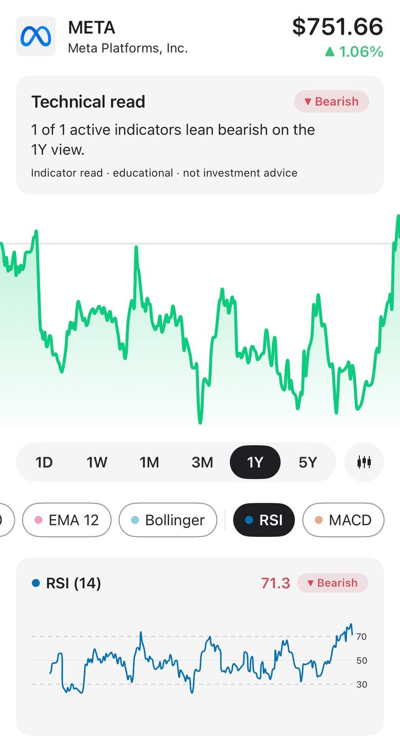
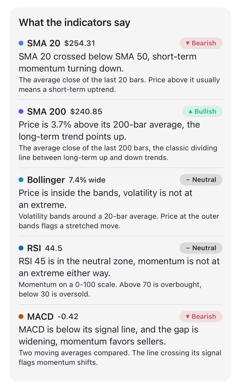
The Technical Analysis page gives the textbook read. Above 70, RSI is overbought, “the rally looks stretched and often pauses from here,” and it counts as a bearish lean in the page’s “X of Y indicators lean bullish” summary. Below 30 it’s oversold and a bullish lean, and in between it’s neutral. Note the wording: a rally that pauses is different from a price about to fall.
The setup score handles RSI differently. Its Momentum part, a quarter of the 0 to 100 score, maps the RSI (14) of daily closes onto a hump:
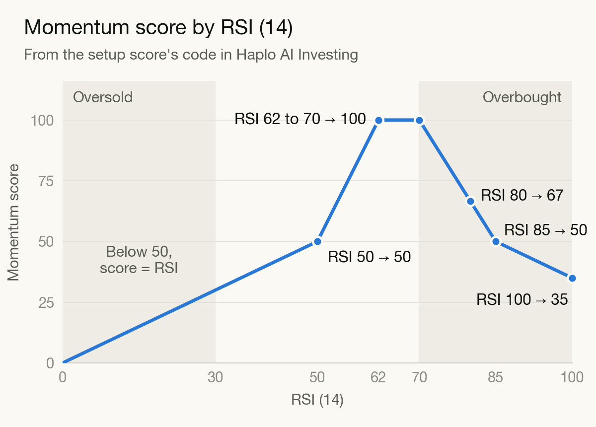
Below 50 the score equals the RSI. It climbs to a full 100 between 62 and 70, “strong momentum without being overbought” in the app’s words. Above 70 it’s trimmed, because “rallies this stretched often pause,” but slowly: an RSI of 80 still scores 67, well above a neutral 50, and it takes 85 to fall back to 50. The code treats overbought as a strong trend running hot, not a weak one.
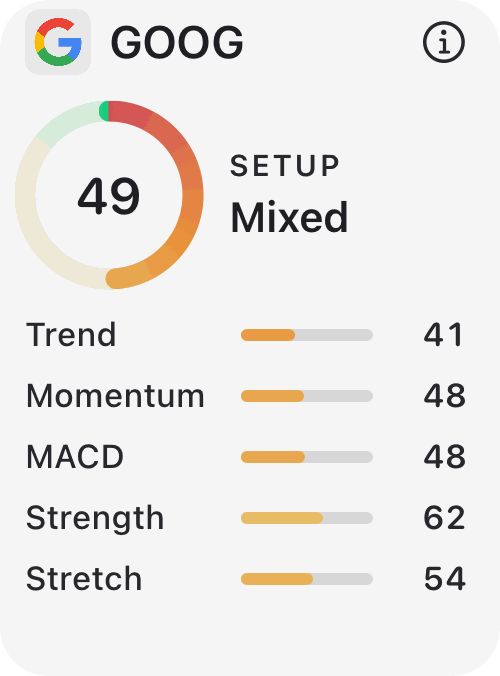
The other four parts add context: Trend (price against its 20- and 50-day averages), MACD (see our MACD guide), Strength (where the price sits in its yearly range) and Stretch (position within the Bollinger Bands). A strong uptrend with an RSI of 80 gives up some Momentum points, and probably some Stretch, while scoring well on Trend and Strength, and the card shows which part carries the total. That’s how we’d read RSI anywhere: as one input, next to the trend.
RSI FAQ
What is a good RSI to buy at?
There isn’t one. RSI describes how lopsided recent moves have been, not whether a stock is cheap, and in the research above no single level worked reliably across markets. Treat it as one input next to the trend, never as a trigger on its own.
What does an RSI of 50 mean?
Average gains and average losses are equal. Some traders treat a cross of 50 as a shift in momentum. That’s the centerline rule Chong, Ng and Liew tested, which beat the 30/70 rule in their data but beat buy-and-hold in only some markets.
Why is my RSI different from another app’s?
Usually it’s the smoothing. Wilder’s average never fully forgets old data, so the result depends on how much history it starts from. StockCharts starts at least 250 data points before a chart’s first date, while the app’s chart starts from the first point it has loaded for your timeframe. Some versions, including the one in Chong, Ng and Liew’s paper, use a plain average over the lookback instead of Wilder’s smoothing, which gives different values again.
How we made this
The formula follows Wilder’s method as documented by StockCharts and Fidelity, and we checked it line by line against Haplo AI Investing’s source code, which uses the same simple first average and 13/14 smoothing. The S&P 500 figures are our own calculations from FRED’s daily closes, which start in September 2016, so every reading had at least a year of data behind it. We picked the examples to show how RSI behaves and ran no backtests. Research findings come from the papers’ abstracts and, for Chong, Ng and Liew, the full text. The app details and the Momentum chart come from the app’s code. The photo is from Wikimedia Commons.
References
- StockCharts ChartSchool. Relative Strength Index (RSI).
- Fidelity Learning Center. Relative Strength Index (RSI). Technical Indicator Guide.
- Federal Reserve Bank of St. Louis. S&P 500 (SP500). FRED, from S&P Dow Jones Indices LLC.
- Park C-H, Irwin SH. What Do We Know About the Profitability of Technical Analysis? Journal of Economic Surveys. 2007;21(4):786-826.
- Chong TT-L, Ng W-K, Liew VK-S. Revisiting the Performance of MACD and RSI Oscillators. Journal of Risk and Financial Management. 2014;7(1):1-12.
- Bajgrowicz P, Scaillet O. Technical trading revisited: False discoveries, persistence tests, and transaction costs. Journal of Financial Economics. 2012;106(3):473-491.
- Jegadeesh N. Evidence of Predictable Behavior of Security Returns. Journal of Finance. 1990;45(3):881-898.
- Jegadeesh N, Titman S. Returns to Buying Winners and Selling Losers: Implications for Stock Market Efficiency. Journal of Finance. 1993;48(1):65-91.
- Moskowitz TJ, Ooi YH, Pedersen LH. Time series momentum. Journal of Financial Economics. 2012;104(2):228-250.
Image credits
- Honda CBR 600 tachometer · Photo: Telempe, CC BY-SA 3.0 (Resized)