 Haplo
Haplo
How to Read a Stock Chart
Candles, wicks, volume, timeframes and moving averages, read on a real chart from the 2023 banking turmoil. Plus what the research says a chart can and can't tell you.
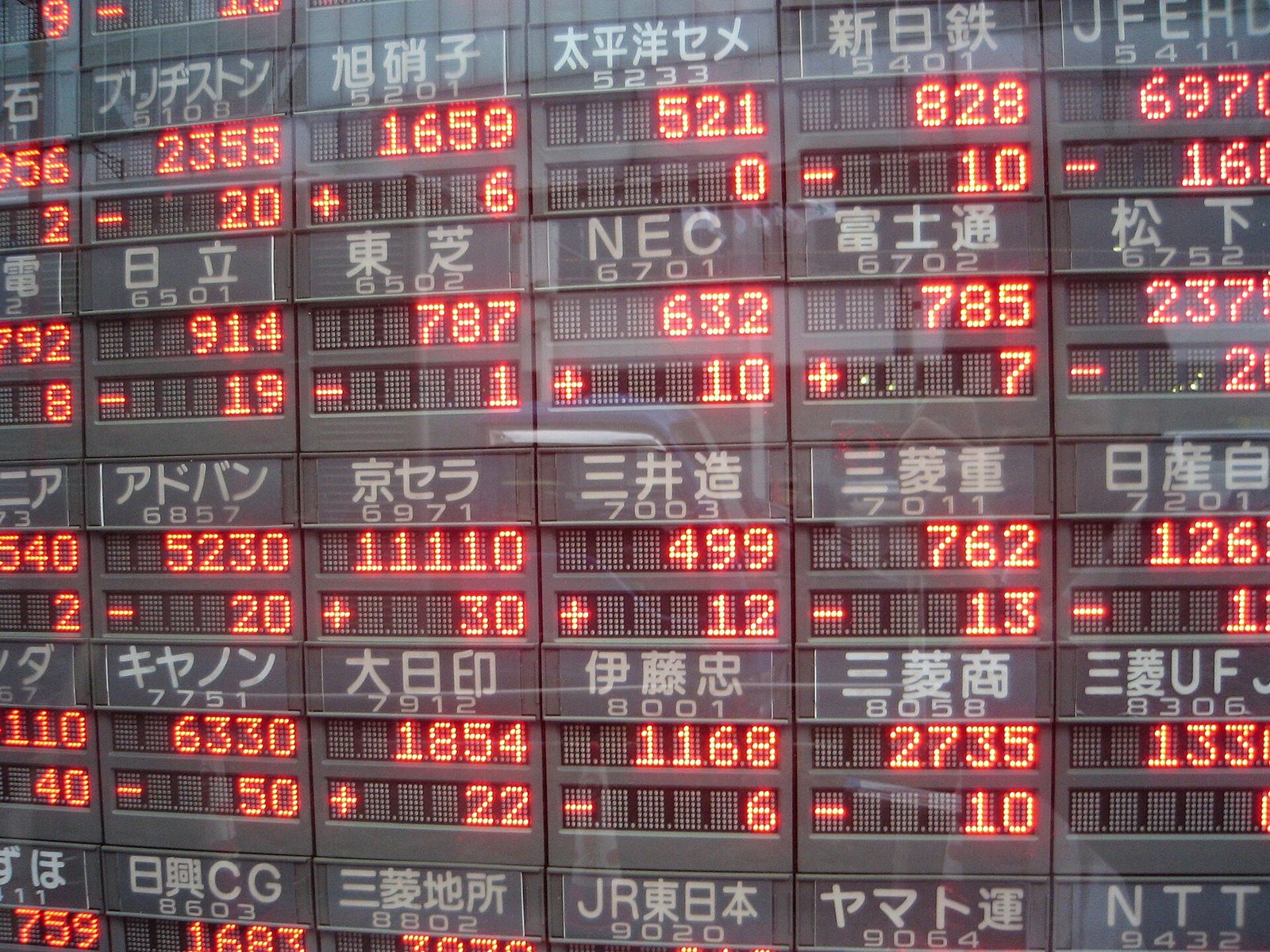
A stock chart is a record of the prices people actually paid for a share, laid out over time. A few seconds with one tells you where the price has been, how rough the ride was, and how much trading it took.
This guide reads a chart in the order we would: candles, volume, timeframe and scale, trend and moving averages, then what a chart can’t tell you. We make Haplo AI Investing, an iPhone app for researching stocks, and this is the walkthrough we’d give anyone opening its charts, though it works on any charting app.
This is education, not investment advice. Nothing here recommends buying or selling anything, and the real tickers below are historical examples.
What a stock chart shows
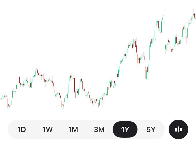
Time runs left to right, price runs up the side, and each period gets one mark. The simplest mark is a dot at the closing price, joined into a line. StockCharts’ ChartSchool notes that some investors prefer a line chart for exactly that reason: it ignores the swings within each day. Bar and candlestick charts keep four prices per period instead of one: the open, high, low and close, or OHLC.
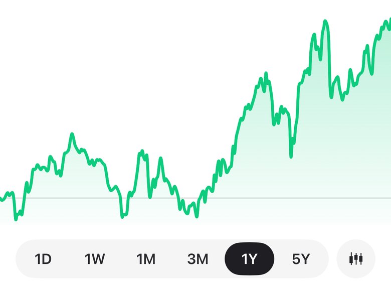
On a daily chart, each period is one trading session: 9:30 a.m. to 4:00 p.m. Eastern time on the New York Stock Exchange. With 10 market holidays in 2026, that’s 251 sessions this year, so a one-year daily chart holds about 250 candles, not 365.
How to read a candlestick chart
The thick part of a candle is the body, which spans the open and the close. The thin lines above and below it are the shadows, or wicks, which reach the high and the low. In ChartSchool’s introduction to candlesticks, a stock that closes above its open gets a hollow candle with the open at the bottom of the body, and one that closes below its open gets a filled candle with the open at the top. Colour charts usually use green and red instead.
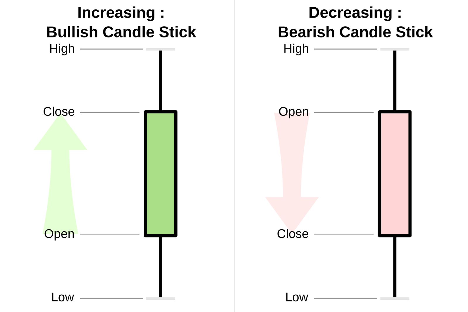
Say a stock opens at $50.00, trades between $49.10 and $52.40, and closes at $51.80. That’s an up candle with a body from $50.00 to $51.80, an upper wick to $52.40 and a lower wick to $49.10.
What the shapes suggest, per ChartSchool:
- A long body: the price moved a long way between the open and the close.
- A long upper wick: buyers pushed the price up, but sellers forced it back down by the close. A long lower wick is the reverse.
- A doji: the open and close are virtually equal, so the body is a line. On its own, it’s a standoff.
Two limits: a candle can’t show the order things happened in, since it records only four prices, and its colour compares the close with that candle’s own open, not with the day before. The method comes from Japanese rice trading, and ChartSchool credits much of it to a legendary trader named Homma from Sakata.
Why a green candle can still be a down day
The chart below shows a common misreading twice. It’s the regional lender PacWest Bancorp in the spring of 2023, when Silicon Valley Bank was closed on Friday, March 10, and investors feared runs at other smaller banks. Here, blue candles closed above their open and crimson ones below.
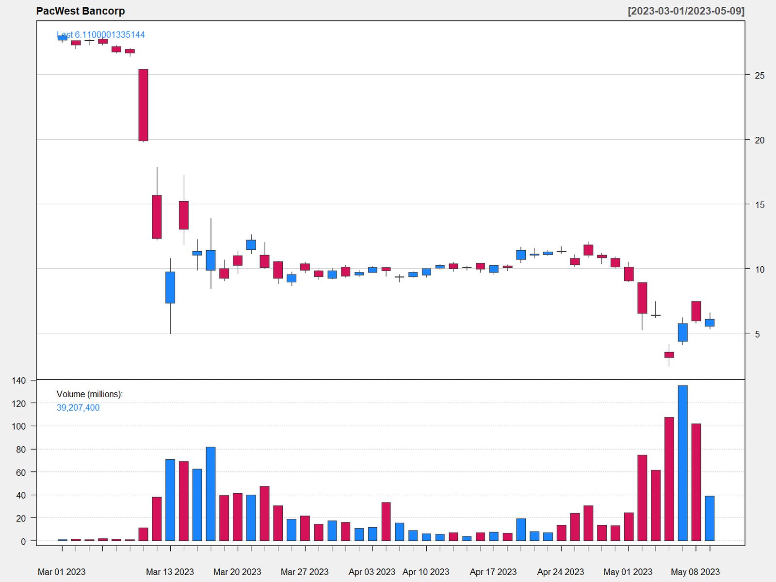
On Monday, March 13, PacWest’s candle is blue. But the whole candle, wicks included, sits below Friday’s close: the stock opened far lower and won back only part of the drop. On Tuesday, March 14, regional banks bounced and PacWest was up 52 percent at one point. Its candle is crimson anyway: the shares opened far above Monday’s close and slid, finishing below their open but well above the day before.
Both days also show gaps, empty space between one candle and the next. ChartSchool defines a down gap as a day whose high stays below the previous day’s low, and an up gap as the reverse. Gaps often come from news that lands while the market is closed, such as an earnings report released after the close. PacWest’s worst day on this chart came later: on May 4 the shares slumped just over 50 percent.
How to read volume on a stock chart
The bars along the bottom of most charts are volume: the number of shares traded in each period. Price shows where trades happened; volume shows how much trading it took.
Judge volume against the stock’s own normal. ChartSchool’s relative volume divides the current bar’s volume by the average over a lookback period, 50 bars by default. A stock that usually trades 2 million shares and trades 6 million today scores 3.0; ChartSchool calls anything over 4.0 a spike.
Chartists read heavy volume as a sign of how committed traders are to a move. In the PacWest chart, the volume panel is nearly empty in early March, then fills up. Unusual volume says something happened. It doesn’t say what, or whether the traders were right.
Pick the timeframe before you read anything
Check two settings first: the candle period and the price scale.
A year is about 250 candles on a daily chart and 52 on a weekly one. Intraday views split one session into minutes or hours, and a jumpy week on a five-minute chart can be a single small candle on a weekly one. We’d always start long, to see the trend, and zoom in.
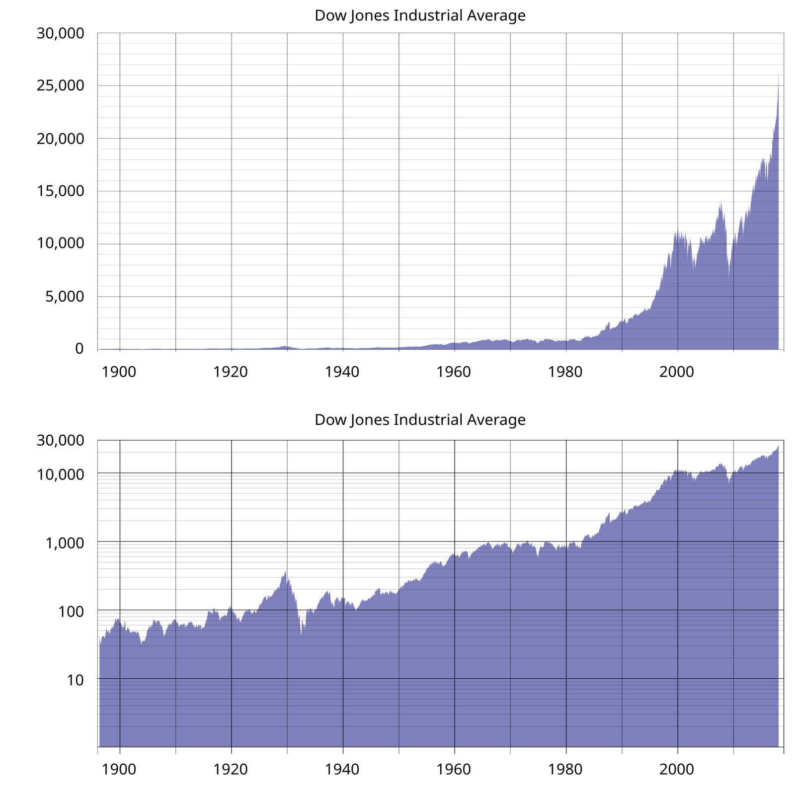
On a linear scale, every dollar is the same height, so a move from $10 to $20 looks the same as one from $70 to $80, though the first doubled the price and the second added 14 percent. On a log scale, equal percentage moves are equal heights, so $10 to $20 looks the same as $40 to $80. That’s why log scales suit long periods, and linear ones short periods in a tight range. On the Dow below, the linear chart makes the first 80 years look flat, while the log chart shows the collapse around 1930 and the climbs either side.
Last, check that the history is adjusted. A split turns each share into several cheaper ones without changing the business. When NVIDIA split ten-for-one, trading on a split-adjusted basis from June 10, 2024, an unadjusted chart would have shown a 90 percent overnight drop that no shareholder suffered. StockCharts warns that on an unadjusted chart most indicators would give sell signals after a split, which is why it rescales all earlier prices and volumes. It adjusts for dividends too, so adjusted history won’t match the price someone actually paid on a given day.
How to spot the trend
In Dow Theory, an uptrend is a series of rising peaks and rising troughs: higher highs and higher lows. A downtrend is lower highs and lower lows. Anything else is a sideways range. Find the swing highs and lows and compare each with the one before.
People also mark support, a price where demand has been strong enough to stop a fall, usually at earlier lows, and resistance, where selling has capped a rise, usually at earlier highs. Neither always holds, and once broken, support can turn into resistance and the other way round.
There’s some evidence for the idea. Carol Osler of the Federal Reserve Bank of New York found that the levels six firms gave their customers in the currency market helped predict where intraday trends would be interrupted, though how well varied by currency and by firm.
How to read moving averages on a stock chart
A moving average smooths recent closes into a line. The simple moving average (SMA) is the plain average of the last N closes: with closes of 100, 102, 101, 105 and 107, the five-day SMA is 515 ÷ 5 = 103. Each day the oldest close drops out and the newest comes in.
The exponential moving average (EMA) weights recent closes more. In ChartSchool’s formula, it starts from an SMA, then each day EMA = (close − previous EMA) × multiplier + previous EMA, with a multiplier of 2 ÷ (N + 1). For a 12-day EMA that’s 2 ÷ 13, about 15 percent: if yesterday’s EMA was 100 and today’s close is 110, today’s EMA is 100 + 10 × 0.154 = 101.54.
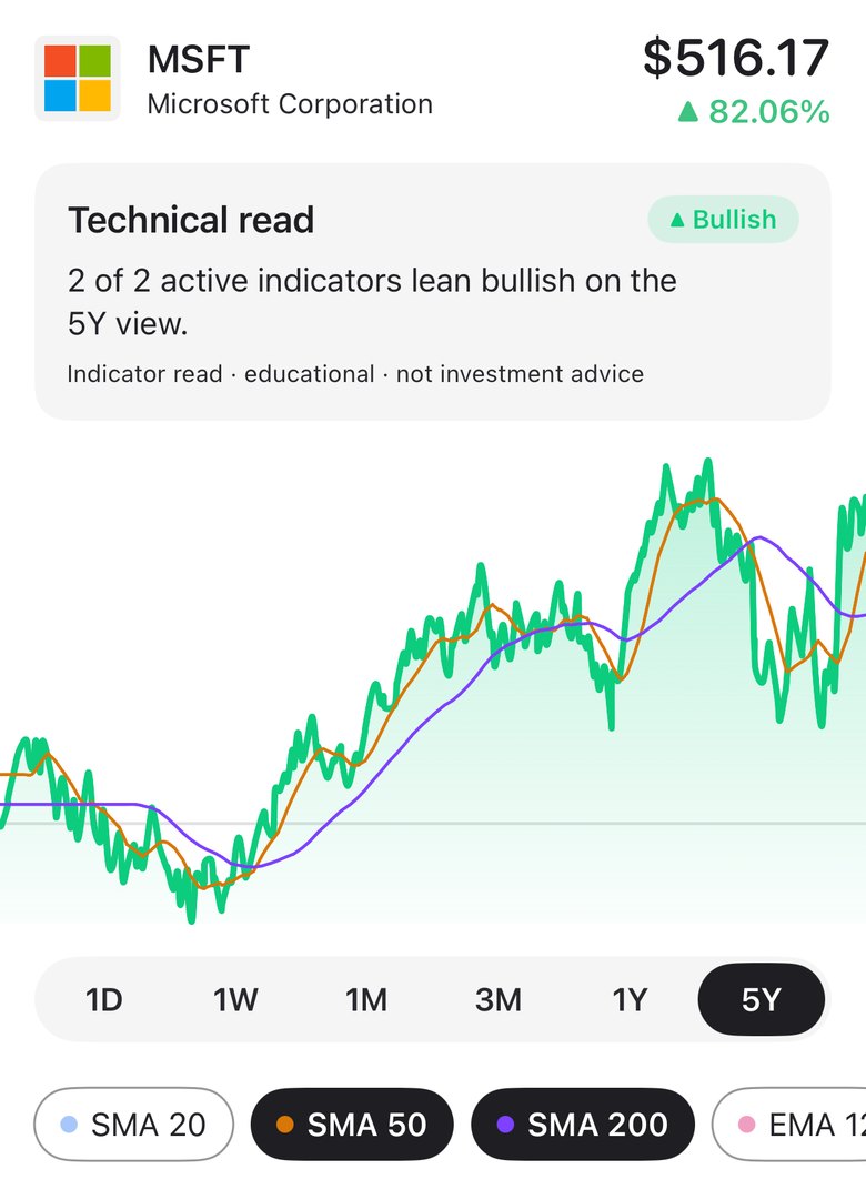
The usual settings are 20, 50 and 200 days: in ChartSchool’s guide, the 20-day tracks short-term trends, the 50-day is popular for the medium term, and the 200-day is the most popular long-term average. Two cautions. A moving average counts bars, not days: 50 bars is about ten weeks on a daily chart but under eight trading sessions on an hourly one. And every moving average lags. The 50 closes in a 50-day SMA are 24.5 trading days old on average, so the line shows roughly where the price was five weeks ago. An EMA reacts faster but still lags.
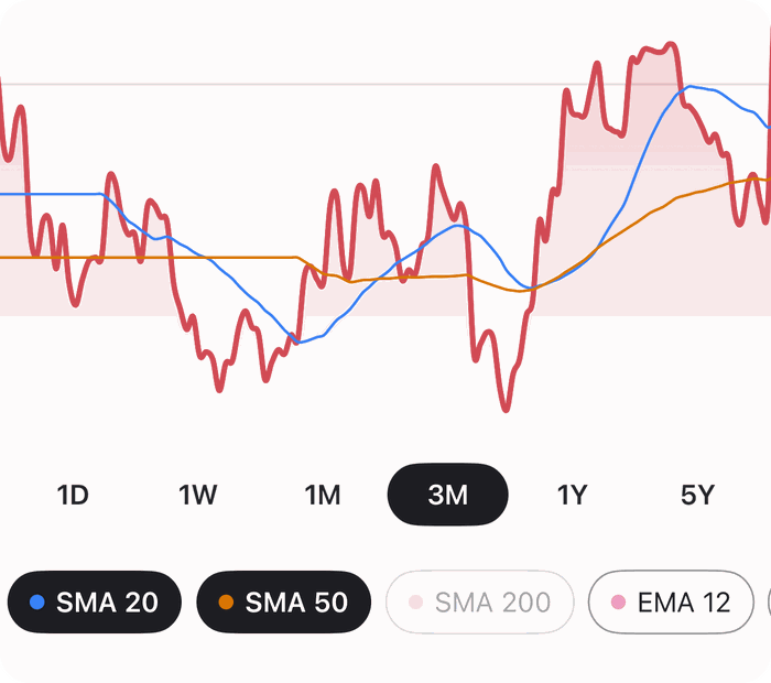
Read three things: whether the price is above or below the average, which way the average slopes, and where the short and long averages sit against each other. The 50-day crossing above the 200-day is called a golden cross, and the reverse a death cross. Our guide to golden and death crosses covers how much they’ve meant.
As trading rules, moving averages have faded. Brock, Lakonishok and LeBaron (1992) found that on the Dow Jones Industrial Average from 1897 to 1986, buy signals from simple moving-average and trading-range rules were followed by higher returns than sell signals. Sullivan, Timmermann and White tested nearly 8,000 rule variations, correcting for data snooping (try enough rules and some look good by luck): some still beat the benchmark over 1897 to 1986, but from 1987 to 1996 there was scant evidence of any economic value. Bajgrowicz and Scaillet (2012), with data to 2011, found an investor could never have picked the future best rules in advance, and that even with hindsight, low transaction costs wiped out the gains.
What a stock chart can’t tell you
A chart is a record of trades. It can’t show you:
- Why the price moved. PacWest’s March candles show a stampede, not the fears behind it. For that you need the news and the filings.
- What the business is worth. Revenue, profit and debt aren’t on a price chart. Even ChartSchool’s list of charting’s guiding principles says the actual price may not reflect the underlying value.
- What happens next. A trend describes the past.
Chart patterns are partly in the eye of the beholder, a subjectivity Lo, Mamaysky and Wang (2000) called one of the main obstacles to studying technical analysis. When they had a computer find the patterns in US stocks from 1962 to 1996, several did carry some incremental information. Candlesticks fared worse: research at Massey University by Ben Marshall, later published with Martin Young and Lawrence Rose, found no evidence that a trader using candlestick strategies on Dow stocks from 1992 to 2002 would beat the market.
Park and Irwin’s 2007 survey is the broadest summary. Early studies found technical trading profitable in currency and futures markets, but not in stocks. Of 95 modern studies, 56 found positive results, 20 negative and 19 mixed, with profits in various markets at least until the early 1990s. But most had problems: data snooping, rules picked after the fact, and risk and trading costs that are hard to estimate.
Use a chart for the trend, the volatility and the moments something changed, then do the rest of the homework. Our guides to the RSI indicator, MACD and whether AI can predict the stock market go further.
A five-step routine for reading any stock chart
- Check the settings: what each candle stands for, linear or log, and whether the history is adjusted.
- Zoom out to a year or five and name the trend: higher highs and higher lows, lower highs and lower lows, or a range.
- Place the averages: is the price above or below its 50-day and 200-day averages, and which way are they sloping?
- Read the recent candles with their volume. Long wicks, gaps and unusually heavy volume mark the days something happened. Find out what.
- Mark the levels and the calendar: the obvious earlier highs and lows, and the next earnings date, since reports released outside market hours are a classic cause of gaps.
Stock chart FAQ
What do red and green candles mean?
A green (or hollow) candle closed above its open, and a red (or filled) one closed below it. The colour compares the close with the same period’s open, not the previous close, so a green candle can still be a losing day, as PacWest’s was on March 13, 2023.
What’s the best timeframe for a stock chart?
The one that matches how long you plan to hold. For long-term investing, we’d start with several years of daily or weekly candles. Intraday charts are mostly for traders.
Do candlestick patterns work?
Not as trading signals, on the best evidence we found: the Massey University study of Dow stocks from 1992 to 2002 found no evidence they beat the market. Read candles as a record, not a forecast.
How we made this
Definitions and formulas come from StockCharts’ ChartSchool and help pages, and the calendar from the NYSE. Research figures come from each paper’s abstract or full text, including the 1998 discussion paper version of Sullivan, Timmermann and White and the 2005 Massey thesis behind the candlestick paper. We checked the PacWest chart, from Wikimedia Commons, against news reports of March 14 and May 4, 2023. The worked examples use our own round numbers.
The formulas match the code of Haplo AI Investing, the stock research app we make: plain-average SMAs, an EMA seeded with an SMA and a 2 ÷ (N + 1) multiplier, and candles only where it has real daily open, high, low and close prices, never on the intraday 1D view. The Trend part of its setup score, 30 percent of the total, measures how far the price sits from its 50-day average and whether the 20-day average is above or below the 50-day. The app labels its indicator reads “educational · not investment advice”, and so do we.
References
- StockCharts ChartSchool: What Are Charts?, Introduction to Candlesticks, Gaps, Relative Volume, Dow Theory, Support & Resistance, Moving Averages; StockCharts Support, Price Data Adjustments.
- NYSE, trading hours; FDIC, SVB closure, 2023; NVIDIA, split announcement, 2024; The Motley Fool, March 14, 2023; NPR, May 4, 2023.
- Brock W, Lakonishok J, LeBaron B. Simple Technical Trading Rules and the Stochastic Properties of Stock Returns. Journal of Finance. 1992;47(5):1731-1764.
- Sullivan R, Timmermann A, White H. Data-Snooping, Technical Trading Rule Performance, and the Bootstrap. Journal of Finance. 1999;54(5):1647-1691.
- Bajgrowicz P, Scaillet O. Technical trading revisited. Journal of Financial Economics. 2012;106(3):473-491.
- Park CH, Irwin SH. What Do We Know About the Profitability of Technical Analysis? Journal of Economic Surveys. 2007;21(4):786-826.
- Lo AW, Mamaysky H, Wang J. Foundations of Technical Analysis. Journal of Finance. 2000;55(4):1705-1765.
- Marshall BR. Candlestick Technical Trading Strategies: Can They Create Value for Investors? PhD thesis, Massey University, 2005; with Young MR, Rose LC in Journal of Banking & Finance. 2006;30(8):2303-2323.
- Osler CL. Support for Resistance: Technical Analysis and Intraday Exchange Rates. Economic Policy Review. 2000;6(2).
Image credits
- Electronic stock board in Yaesu, Tokyo 2007 · Photo: nappa, CC BY 2.0 (Resized)
- Candlestick chart scheme 03-en · Diagram: Probe-meteo.com, CC BY-SA 3.0 (Rendered as a JPEG and resized)
- PacWest candlestick cb 2023-03-01 and 2023-05-09 · Chart: Dr vulpes, CC0 (Converted to JPEG and resized)
- DJIA historical graph · Chart: Lalala666 at English Wikipedia, Public domain (Rendered as a JPEG, resized and stacked above the log version)
- DJIA historical graph (log) · Chart: Lalala666 at English Wikipedia, Public domain (Rendered as a JPEG, resized and stacked below the linear version)