 Haplo
Haplo
MACD Indicator Explained
Two lines and a row of bars that answer one question: is a stock's short-term trend pulling away from its longer-term trend, or closing in on it? We work the formula through real SPY prices, show why the signals arrive late, and check what the research says.

Add MACD to a stock chart and a new panel appears under the price: two wavy lines, a row of bars, a zero line, and a vocabulary of crossovers and divergences. Under the jargon, the MACD indicator answers one plain question: is the stock’s short-term trend pulling away from its longer-term trend, or closing in on it?
This guide builds MACD from scratch with real closing prices for SPY, an exchange-traded fund that tracks the S&P 500, then follows it through the spring 2025 sell-off and checks what research says about trading on it. We make Haplo AI Investing, an iPhone stock research app that draws MACD and reads it in plain words, so we checked every formula here against the app’s code and published references.
This is education, not investment advice. Nothing here is a recommendation to buy or sell anything, and a pattern in past prices is not a forecast.
What is the MACD indicator?
MACD stands for Moving Average Convergence/Divergence. Gerald Appel developed it in the late 1970s. The idea: take a fast moving average of a stock’s price and a slow one, and track the gap between them. When the averages move toward each other they converge; when they move apart they diverge. The gap swings above and below zero, so MACD is an oscillator; StockCharts’ ChartSchool sums up its appeal as trend and momentum in one indicator. The panel has four parts:
- The MACD line: the gap between a 12-day and a 26-day exponential moving average of the closing price.
- The signal line: a 9-day average of the MACD line, a slower copy of it.
- The histogram: the gap between those two lines, drawn as bars. Thomas Aspray developed it to anticipate their crossovers.
- The zero line: where the two price averages are equal.
Even the inventor frames the big claim as a question: the MACD chapter of Appel’s 2005 book, Technical Analysis: Power Tools for Active Investors, is titled “Advanced Moving Average Convergence-Divergence (MACD): The Ultimate Market Timing Indicator?”, question mark included.
How MACD is calculated
Exponential moving averages, briefly
An exponential moving average, or EMA, counts recent prices more than old ones. It starts as a simple average of the first n closes; after that, each day it moves a fixed fraction of the way toward the latest close:
EMA today = EMA yesterday + (today’s close − EMA yesterday) × 2 ÷ (n + 1)
That’s StockCharts’ method. For a 12-day EMA the multiplier is 2 ÷ 13, so today’s close carries about 15.4 percent of the weight; for a 26-day EMA it’s 2 ÷ 27, about 7.4 percent. That difference in speed drives everything: after a sharp move, the 12-day average catches up faster and the gap opens. Our guide to reading a stock chart covers simple averages first.
The MACD formula
With closing prices and the standard settings of 12, 26 and 9:
- MACD line = 12-day EMA − 26-day EMA
- Signal line = 9-day EMA of the MACD line
- Histogram = MACD line − signal line
Those are StockCharts’ definitions, and Fidelity’s indicator guide uses the same periods. The periods count bars, so on a weekly chart they mean weeks. Because the MACD line is one price average minus another, it’s in the stock’s own currency: a MACD of +8.54 on SPY means the 12-day average sits $8.54 above the 26-day.
A worked example with real prices
SPY on two days in July 2025, with averages carried forward from years of earlier closes, rounded to the cent:
| Date | Close | 12-day EMA | 26-day EMA | MACD line | Signal line | Histogram |
|---|---|---|---|---|---|---|
| 14 July 2025 | $624.81 | 619.44 | 610.45 | 8.99 | 8.91 | +0.08 |
| 15 July 2025 | $622.14 | 619.86 | 611.32 | 8.54 | 8.84 | −0.30 |
The 15th, step by step:
- 12-day EMA: 619.44 + (622.14 − 619.44) × 2 ÷ 13 = 619.86
- 26-day EMA: 610.45 + (622.14 − 610.45) × 2 ÷ 27 = 611.32
- MACD line: 619.86 − 611.32 = 8.54
- Signal line: 8.91 + (8.54 − 8.91) × 2 ÷ 10 = 8.84
- Histogram: 8.54 − 8.84 = −0.30
The histogram turned negative, so the MACD line had crossed below its signal line: a bearish crossover. Yet SPY closed just 0.4 percent lower, 0.6 percent below its record close of $625.82 on 10 July, and above both averages. Both averages rose; the 26-day rose more, because the close was further above it, so the gap narrowed.
The lesson: a “bearish” crossover doesn’t need a falling price, only a rise that’s slowing. Eight trading days later MACD crossed back above its signal line, and two trading days after that, below again. SPY finished August at $645.05.
How to read MACD
Signal-line crossovers
A bullish crossover is the MACD line crossing above its signal line; a bearish one is a cross below. The histogram changes sign on the same day. StockCharts calls these the most common MACD signals, and common is the word: from 2017 to 2025, SPY’s daily MACD crossed its signal line 202 times, about 22 times a year, or once every 11 trading days. In 2021, when SPY rose 27 percent, it crossed 29 times.
Zero-line crossovers
When the MACD line crosses zero, the 12-day EMA is crossing the 26-day EMA. Above zero, the short average is the higher one, and StockCharts reads a widening positive gap as growing upside momentum; below zero is the reverse. These crossovers are rarer: 58 for SPY over the same nine years. They’re a faster relative of the golden and death crosses, which use 50-day and 200-day simple averages; see our golden cross guide.
The MACD histogram
The bars show how far the MACD line is from its signal line. When they shrink toward zero, the lines are converging and a crossover may be near, which is what Aspray designed the histogram to flag. It’s also the twitchiest part of the panel, and StockCharts notes that short, shallow histogram divergences are much more frequent than long, large ones, and less robust.
Divergences
In a bearish divergence, the price makes a higher high while MACD makes a lower high, a sign the rise is losing speed; a bullish divergence is the mirror image at a low. StockCharts warns: “Bearish divergences are commonplace in a strong uptrend, while bullish divergences occur often in a strong downtrend.” Momentum can fade for a long time while the trend carries on.
Why you can’t compare MACD across stocks
MACD is in dollars, so its size depends on the price. In StockCharts’ example, a $20 stock’s MACD might range from −1.5 to +1.5 and a $100 stock’s from −10 to +10, so “it is not possible to compare MACD values for a group of securities with varying prices.” It skews one stock over time, too: SPY’s MACD bottomed at −23.79 on 23 March 2020 and at −17.50 on 8 April 2025, but SPY cost more than twice as much in 2025. As a share of the 26-day average, those lows were −8.6 and −3.2 percent. That percentage version has its own name, the Percentage Price Oscillator.
MACD also has no ceiling or floor, so it has no fixed overbought or oversold levels. RSI, by contrast, runs from 0 to 100; our RSI guide explains why overbought can stay overbought.
MACD in a real sell-off: SPY in 2025
SPY closed at a record $612.93 on 19 February 2025, fell 19 percent in seven weeks to $496.48 on 8 April, and didn’t close above the February peak again until 27 June.
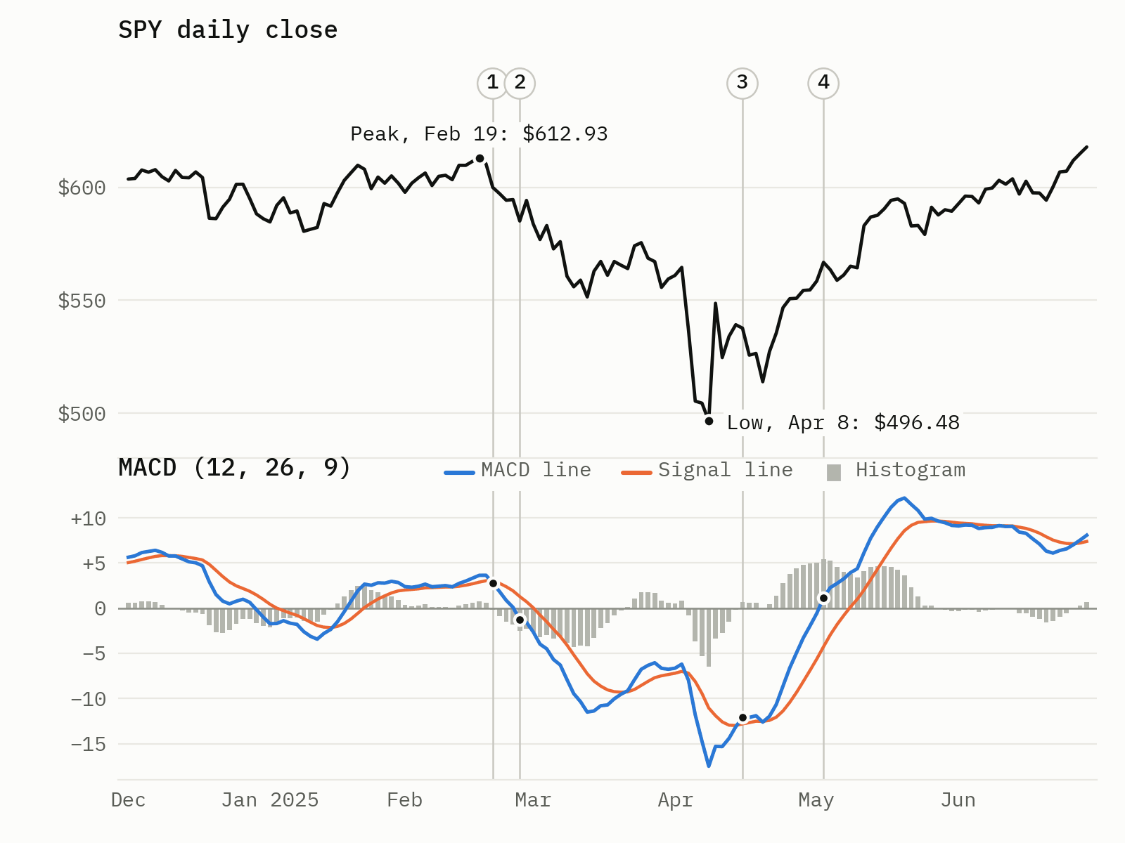
- 21 February, two trading days after the peak: MACD crossed below its signal line. SPY: $599.94, 2.1 percent below its high.
- 27 February: MACD crossed below zero. SPY: $585.05, 4.5 percent below the high.
- 15 April, five trading days after the low: MACD crossed back above its signal line. SPY: $537.61, already 8.3 percent above the low.
- 2 May, 17 trading days after the low: MACD crossed above zero. SPY: $566.76, 14.2 percent above the low.
In between, a bullish crossover on 21 March came to nothing: SPY fell another 12 percent from that day’s close by 8 April. The 15 April crossover also flipped back for a single day on 21 April.
The lag is built in: MACD is made of moving averages, and averages turn only after prices do. At the top, the first crossover came quickly because MACD was barely above its signal line when the fall began. At the bottom, it came a week after the low, and the zero-line crossover only after SPY had won back 60 percent of what it had lost.
The 2020 crash had the same shape. SPY peaked at $338.34 on 19 February 2020 (the same date, by coincidence) and fell 34 percent to $222.95 on 23 March. MACD crossed below its signal line on 21 February and below zero on 26 February. It crossed back above its signal line three trading days after the low, with SPY already up 17 percent, and above zero 17 trading days after the low, with SPY up 25 percent.
Why hindsight flatters MACD
On a chart today, the crossover of 21 February 2020 looks prescient. In real time it was the sixth bearish crossover in under three months, counting from 2 December 2019, and after each of the first five, SPY had gone on to close higher. The chart alone gave no way to tell which one would matter.
What MACD can’t tell you
- When a move will start. “Because MACD uses moving averages and moving averages lag price, signal line crossovers can come late,” as StockCharts puts it.
- Whether a sideways market will break. In a trading range, “the MACD will whipsaw, with the fast line crossing back and forth across the signal line,” in Fidelity’s words.
- Why anything is happening. MACD is arithmetic on closing prices. It knows nothing about earnings, news, interest rates or valuation.
- Anything independent. Moving averages, RSI and MACD all come from the same closes, so three bullish readings aren’t three independent votes.
Does MACD work? What the research says
The short version of decades of research: some rules made money in some markets and periods, and the evidence weakens once you count trading costs and how many rules were tried.
- The survey. Park and Irwin (2007) reviewed 95 modern studies: 56 found positive results for technical trading, 20 negative and 19 mixed, with profits “at least until the early 1990s”. But most studies had problems, such as data snooping, rules chosen after the fact, and hard-to-estimate risk and transaction costs.
- The famous positive result. Brock, Lakonishok and LeBaron (1992) tested moving-average and trading-range rules on the Dow Jones Industrial Average from 1897 to 1986 and found strong support: returns after buy signals were higher, and less volatile, than after sell signals.
- The follow-up. Sullivan, Timmermann and White (1999) tested nearly 8,000 rule variations on the Dow. The earlier result survived a data-snooping correction for 1897 to 1986, but the best rule’s performance was “not repeated” from 1987 to 1996, and S&P 500 futures from 1984 to 1996 showed no evidence that any rule beat the benchmark.
- The long view. Bajgrowicz and Scaillet (2012) took the Dow from 1897 to 2011 and concluded that investors could never have picked the future best rules in advance, and that low transaction costs wiped out the performance even in-sample.
MACD itself has had less attention. Chong, Ng and Liew (2014) tested it on daily closes from 1976 to 2002 in Italy, Canada, Germany, Japan and the Dow Jones Industrials. The classic signal-line rule, MACD(12, 26, 9), showed no predictive power in four of the five markets, and in Germany following it lost an average of 0.94 percent per pair of buy and sell signals. The slower zero-line rule beat buy-and-hold in Italy and Canada, even after a 1 percent round-trip cost, but not elsewhere. On the Dow, the ten days after signal-line buys averaged slightly worse than the ten days after sells, though not significantly. An earlier study by Chong and Ng found MACD and RSI rules beat buy-and-hold on 60 years of monthly data for London’s FT30 index.
Our reading: MACD is a good way to describe what momentum has been doing and a weak way to predict what prices will do next, and the crossover most charts highlight had the weakest record in the one direct test above. More on forecasting in our look at whether AI can predict the stock market.
MACD FAQ
What are the best MACD settings?
There’s no best, only trade-offs. StockCharts suggests MACD(5, 35, 5) for more sensitivity, perhaps on weekly charts, and longer averages for fewer crossovers. Faster isn’t automatically better: in Chong, Ng and Liew’s tests, a quicker MACD(8, 17, 9) gave buy signals that did significantly worse than its sell signals in Italy and Germany.
Is MACD a leading or lagging indicator?
Lagging: every part is built from moving averages of past closes. The histogram can shrink before a crossover arrives, but it’s made from the same lagging lines.
Is MACD better than RSI?
They measure different things. RSI compares recent gains with recent losses on a 0 to 100 scale; MACD measures the gap between two price averages. In the five-market study, neither worked everywhere: RSI rules earned significant returns in some markets and MACD rules in others.
How we made this
The prices are SPY’s daily closes from Nasdaq’s historical quotes, 26 September 2016 to 24 September 2026, not adjusted for dividends. We calculated MACD from the first close; by January 2017 the starting values carried under 1 percent of the weight. Crossover counts cover 2017 to 2025, each dated to the first close on which it showed. We didn’t test a trading rule: the counts and dates describe what the indicator did, not what it will do.
We checked the formulas against StockCharts’ ChartSchool and the source code of Haplo AI Investing, which computes MACD the same way: EMAs seeded with a simple average and weighted 2 ÷ (n + 1), a 9-period EMA of the MACD line as the signal line, and their difference as the histogram. In the app, MACD is an optional chart indicator, calculated from the closes of whichever time range you’re viewing. Its panel, labelled MACD (12, 26, 9), draws the MACD line, a dashed signal line, a zero line and histogram bars, green above zero and red below, with a plain-language read such as “MACD is above its signal line, and the gap is widening, momentum favors buyers.”
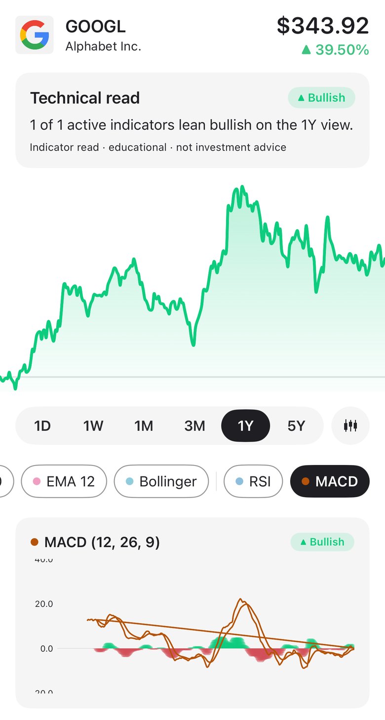
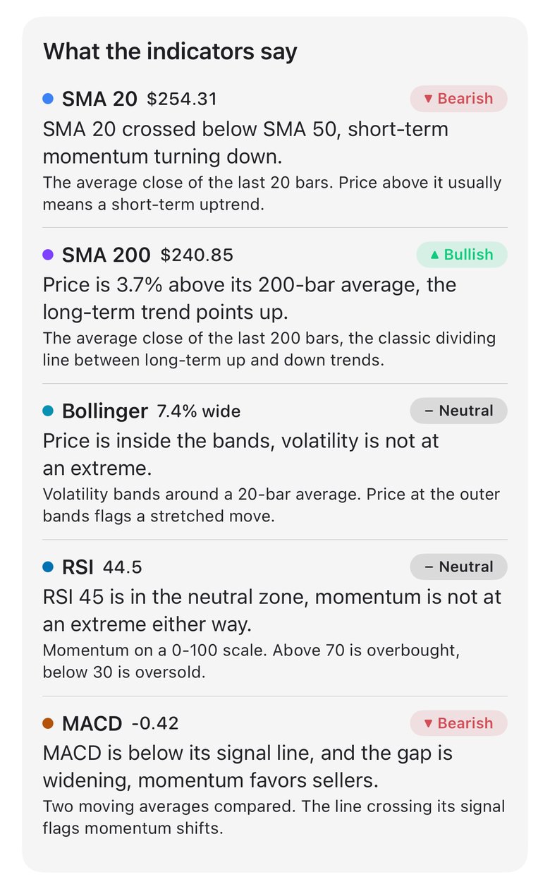
MACD is also one of the five parts of the app’s 0 to 100 setup score, worth 20 percent. To compare a $10 stock with a $500 one, the app divides the gap between the MACD line and its signal line by the stock’s typical daily move (its price times the standard deviation of its last 21 daily returns). A MACD sitting on its signal line scores 50. Every part of the score is shown, and every screen with these reads is labelled educational, not investment advice.
Research findings come from each paper’s abstract or full text, and we left out numbers we couldn’t check against a primary source. The chart is our own; the photo is from Wikimedia Commons.
Image credits
- Railway tracks 2 028 · Photo: StooMathiesen, CC BY 2.0 (Resized)