 Haplo
Haplo
Golden Cross and Death Cross Explained
The 50-day average crossing the 200-day is one of the most quoted signals in investing. Here's how it's built, why it always arrives late, and what more than a century of market data says about trading on it.

When the S&P 500’s 50-day moving average slipped below its 200-day average on April 14, 2025, the financial press called it a death cross. About eleven weeks later, on July 1, the same two lines crossed back the other way, and market commentators called that a golden cross. Both names sound like forecasts. Both are really summaries of what prices have already done.
This guide covers what the two crosses are, how the averages behind them work, why the signal always arrives late, and what more than a century of research says about trading them. We make Haplo AI Investing, an iPhone stock research app whose Technical Analysis page names these crosses when they happen, so we wanted to be clear about what that label can and can’t tell you.
This is education, not investment advice. Nothing here is a recommendation to buy, sell or hold anything.
What is a golden cross?
A golden cross is the day a stock’s or an index’s 50-day simple moving average (SMA) rises above its 200-day SMA. StockCharts’ ChartSchool calls the 200-day perhaps the most popular long-term moving average and notes that many chartists use it together with the 50-day. When the shorter average crosses above the longer one, it’s read as a bullish signal; when it crosses below, a bearish one.
How the moving averages are calculated
A simple moving average is the plain average of the last N closing prices:
50-day SMA = (sum of the last 50 daily closes) ÷ 50
Each day the newest close joins the average and the oldest drops out, which is why the line moves. ChartSchool’s example uses five days: closes of 11, 12, 13, 14 and 15 average 13, and the next day, with 12 to 16, the average is 14. The 200-day SMA works the same way over 200 closes, about nine and a half months of trading.
Some traders use exponential moving averages (EMAs), which weight recent prices more heavily, lag less and cross sooner; EMAs are also the building blocks of MACD. The classic golden cross uses simple averages.
A worked example of the lag
ChartSchool’s rule is simple: the longer the average, the more the lag. A steady trend shows exactly how much. Picture a stock that rises by $1 every trading day. Its 50-day average equals the price 24.5 days ago, so it sits $24.50 below today’s close. Its 200-day average equals the price 99.5 days ago, $99.50 below. When a trend turns, the 50-day line needs weeks to follow, the 200-day line needs months, and the cross between them can’t happen until both have moved.
What is a death cross?
A death cross is the mirror image: the 50-day SMA falls below the 200-day SMA. ChartSchool calls it a bearish chart pattern and warns that death crosses and golden crosses “occasionally fail to follow through”.
How to spot a golden cross on a chart
Put both averages on a daily chart. The golden cross is the first close where the 50-day line finishes above the 200-day line after being below it; the death cross is the reverse. Two details change what you see:
- Closing or intraday prices. The dates in this guide use daily closes. A cross measured on intraday prices can appear and vanish within a session, so sources can disagree about the date.
- The bar size. On a weekly chart, 50 and 200 bars mean 50 and 200 weeks, a much slower signal. On an hourly chart they mean hours. Our guide to reading a stock chart covers bars and timeframes.
Why the golden cross always comes late
The S&P 500 has had four death crosses since 2018, each followed months later by a golden cross. This is where each one landed against the market’s turns, by our count from FRED’s daily closes of the index (which exclude dividends):
| Death cross | S&P 500 vs its prior high | Closing low | Golden cross | S&P 500 vs the low |
|---|---|---|---|---|
| Dec 7, 2018 | 10% below | Dec 24, 2018: 11 trading days after the cross | Apr 1, 2019 | 22% above |
| Mar 30, 2020 | 22% below | Mar 23, 2020: 5 trading days before the cross | Jul 9, 2020 | 41% above |
| Mar 14, 2022 | 13% below | Oct 12, 2022: 7 months after the cross | Feb 2, 2023 | 17% above |
| Apr 14, 2025 | 12% below | Apr 8, 2025: 4 trading days before the cross | Jul 1, 2025 | 24% above |
Every death cross came after the index had already fallen 10 to 22 percent from its high, and twice, in 2020 and 2025, in the week after the closing low. In 2022 it did come ahead of a long slide: the index fell another 14 percent before bottoming in October. Every golden cross came 57 to 77 trading days after the low, with the index already 17 to 41 percent off the bottom. The 2023 golden cross arrived within 0.2 percent of the level of the 2022 death cross, 224 trading days later.
A longer record points the same way. A Reuters analysis of LSEG data covering roughly 50 years found 24 S&P 500 death crosses. In 54 percent of them, the cross came after the point of the index’s maximum intraday decline, meaning the worst of the slide had already happened. In the other 46 percent the selloff worsened, by 19 percent on average from the cross, and the selloffs that followed the death crosses of 1981, 2000 and 2007 ultimately reached 21, 45 and 55 percent.
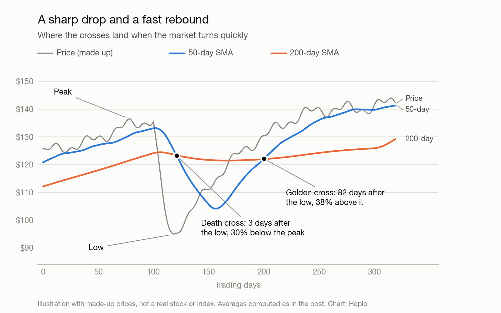
The Nasdaq Composite’s 2020 death cross, by our count from FRED’s data, came even later: on April 16, with the index already 24 percent above its March 23 low.
Whipsaws: when the crosses flip back and forth
When prices go sideways, the two averages drift together and cross again and again. Each cross reports a move that has already happened, and the next one takes it back. Traders call these false signals whipsaws. In their 1992 study, Brock, Lakonishok and LeBaron called them “whiplash” signals and tested a 1 percent band, which only counts a crossing once the averages are at least 1 percent apart, as a way to filter them out.
A real case: the Nasdaq Composite crossed four times in under eight months. It had a death cross on September 28, 2015, a golden cross on December 9, another death cross on January 20, 2016 and another golden cross on May 19, 2016. The December golden cross came with the index at 5,023; the death cross six weeks later came at 4,472, 11 percent lower.
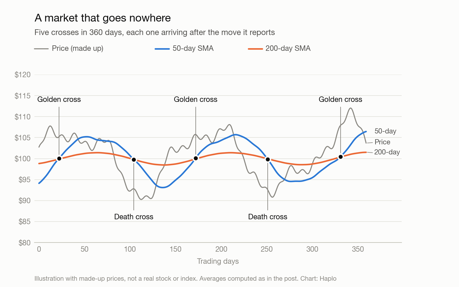
ChartSchool’s summary of crossover systems fits: the signals are relatively late, because both lines lag, and when there’s no strong trend they produce many whipsaws.
Does the golden cross work? What the research says
The 1992 study that made the case
The best-known test is by William Brock, Josef Lakonishok and Blake LeBaron, published in the Journal of Finance in 1992. They ran moving-average rules on the Dow Jones Industrial Average from 1897 to 1986. They didn’t test the 50/200 cross itself: their rules compared the daily price, or a 2-day or 5-day average, with a 50-day, 150-day or 200-day average. The paper names the price-versus-200-day rule as the most popular.
Across their ten versions of the rule, “buy” days, when the short average sat above the long one, returned 0.042 percent on average, about 12 percent a year. “Sell” days returned minus 0.025 percent, about minus 7 percent a year. The average for all days was 0.017 percent. But the index series had no dividends, the tests left out trading costs, and the authors added that “transactions costs should be carefully considered before such strategies can be implemented.”
What happened when others checked
Test enough rules on the same data and some will look good by chance, a problem called data snooping. Ryan Sullivan, Allan Timmermann and Halbert White tested for it directly, building a universe of nearly 8,000 rule variants and running them on the Dow from 1897 to 1996. The best rules still beat the benchmark over 1897 to 1986, even after the adjustment. But in the ten years after the original study, 1987 to 1996, they found “scant evidence that technical trading rules were of any economic value.” On S&P 500 futures from 1984 to 1996, where trading costs are low and going short is easy, they found no evidence that the rules outperformed.
Pierre Bajgrowicz and Olivier Scaillet extended the Dow test to 2011 with a different way of controlling for data snooping. They concluded that an investor “would never have been able to select ex ante the future best-performing rules,” and that “even in-sample, the performance is completely offset by the introduction of low transaction costs.”
The literature as a whole
In 2007, Cheol-Ho Park and Scott Irwin reviewed the evidence on technical analysis in the Journal of Economic Surveys. Of 95 modern studies, 56 found positive results, 20 negative and 19 mixed, with profits showing up in a variety of markets “at least until the early 1990s.” But the authors found most of the studies had problems in their testing, including data snooping, rules chosen after the fact, and difficulties estimating risk and transaction costs.
The statistics you’ll see in the news
Strategists also publish counts of what the index did after past crosses. The Motley Fool, citing Carson Investment Research, reported that since 1950 the S&P 500 has been higher a year after a golden cross 80 percent of the time, with a median return of 13 percent. That sounds impressive until you set it against the base rate. In Aswath Damodaran’s annual return data at NYU Stern, the S&P 500 with dividends rose in 58 of the 74 calendar years from 1950 to 2023, about 78 percent. The two measures aren’t identical, but the point holds: being higher a year later is what the index usually does, cross or no cross.
After death crosses, Bank of America technical strategist Paul Ciana found in nearly 100 years of data that the S&P 500 fell 52 percent of the time over the following 20 days, by 0.5 percent on average, and was higher 60 percent of the time 30 days out, according to the Reuters report. Neither is far from a coin flip.
So, does it work?
Our reading: a golden cross fairly describes a market that has been rising for a while, and a death cross one that has been falling. As a timing signal, the edge found in older data hasn’t held up in later decades once costs and data snooping are counted, and the cross arrives after much of the move. It’s a summary of the past few months, not a forecast. The same question about machine learning gets its own look in whether AI can predict the stock market.
How to read a golden cross or a death cross
A few questions put any cross in context:
- How far has the price already moved? Compare the price at the cross with the recent high or low. The S&P 500’s 2020 death cross came with the index 17 percent above its low.
- Has the market been trending at all? A flat 200-day line, or several crosses in a year, points to a sideways market, where whipsaws happen.
- What else is going on? A moving average knows nothing about a company’s earnings, debt or valuation.
Golden cross and death cross FAQ
Is a golden cross bullish?
By convention it’s read that way, and it does confirm that the medium-term average has risen above the long-term one, which only happens after prices have climbed. Whether they keep climbing is a separate question. In the studies above, the forecasting edge of moving-average rules didn’t hold up in data from the late 1980s on.
What happens after a death cross?
It varies. In the Reuters analysis of 24 S&P 500 death crosses, just over half came after the worst of the decline; the rest were followed by further falls averaging 19 percent.
How often does the S&P 500 have a golden cross?
Not often. CNBC reported in April 2025 that the S&P 500 had formed 50 death crosses since 1928. The two crosses alternate, so golden crosses are about as common: roughly one pair every two years on average. Since mid-2017 we count four of each.
How we made this
The cross dates and index levels come from FRED’s daily closes for the S&P 500 (a price index without dividends, for which FRED keeps ten years of history) and the Nasdaq Composite. We computed 50-day and 200-day simple moving averages of the closes and marked a cross on the first close where the 50-day moved from at or below the 200-day to above it (golden), or from at or above it to below (death). Our averages for April 14, 2025 (about 5,748 and 5,754) match the ones Reuters reported that day. The two charts are illustrations drawn from made-up prices, not market data. Study figures come from the papers or their abstracts, and the Wall Street statistics from the linked reports. We didn’t run backtests of our own.
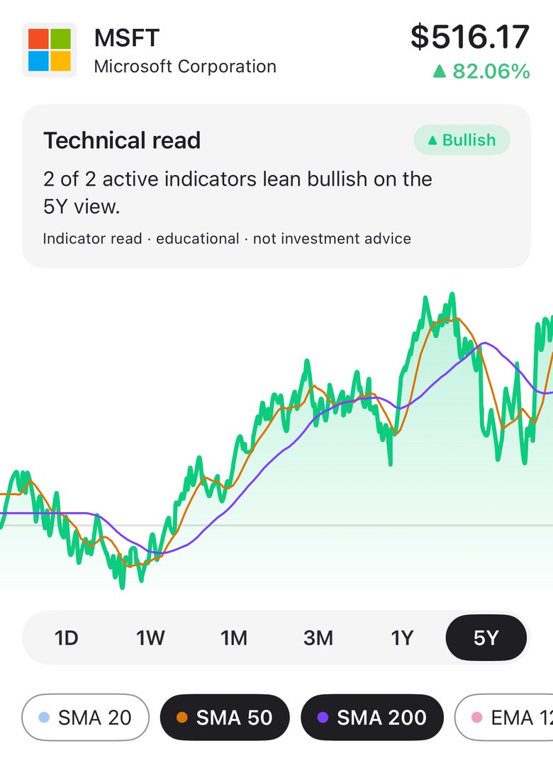
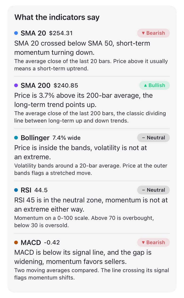
Haplo AI Investing uses the same definition. On its Technical Analysis page, the 1Y and 5Y views are built from daily closes; SMA 50 is on by default and SMA 200 is one tap away (it needs 200 closes, so shorter views don’t offer it). When the 50-day has crossed the 200-day within the last five bars, the SMA 50 read says so: “SMA 50 crossed above SMA 200, the classic golden cross, a long-term bullish sign,” or the death-cross equivalent. After five bars, the read goes back to describing where the price sits against its 50-day average. The app’s 0 to 100 setup score doesn’t use the 200-day at all: its Trend part measures the price and the 20-day average against the 50-day. The page carries an “educational · not investment advice” label.
The hero photo is from Wikimedia Commons.
References
- Brock W, Lakonishok J, LeBaron B. Simple Technical Trading Rules and the Stochastic Properties of Stock Returns. Journal of Finance. 1992;47(5):1731-1764.
- Sullivan R, Timmermann A, White H. Data-Snooping, Technical Trading Rule Performance, and the Bootstrap. Journal of Finance. 1999;54(5):1647-1691. Linked: LSE discussion-paper version.
- Bajgrowicz P, Scaillet O. Technical trading revisited: False discoveries, persistence tests, and transaction costs. Journal of Financial Economics. 2012;106(3):473-491.
- Park CH, Irwin SH. What Do We Know About the Profitability of Technical Analysis? Journal of Economic Surveys. 2007;21(4):786-826.
- StockCharts ChartSchool. Moving Averages: Simple and Exponential.
- StockCharts ChartSchool. Trading the Death Cross.
- Federal Reserve Bank of St. Louis, FRED. S&P 500 (SP500), daily close, and NASDAQ Composite Index (NASDAQCOM), daily close.
- Ahmed SI, Gabriel T. S&P 500’s ‘death cross’ may not be as ominous as it sounds, analysts say. Reuters, via Yahoo Finance. April 14, 2025.
- Harring A. The S&P 500 formed an ominous ‘death cross.’ What history says happens next. CNBC. April 24, 2025.
- Cimino A. The S&P 500 Just Made a Striking Move That Signals Something Big Ahead. The Motley Fool. July 8, 2025.
- Damodaran A. Historical Returns on Stocks, Bonds and Bills. NYU Stern School of Business, January 2024 update.
Image credits
- Market data on display at Taiwan Stock Exchange 20210208 · Photo: Office of the President, Republic of China (Taiwan), CC BY 2.0 (Resized)