 Haplo
Haplo
Coffee Shop Logo Ideas
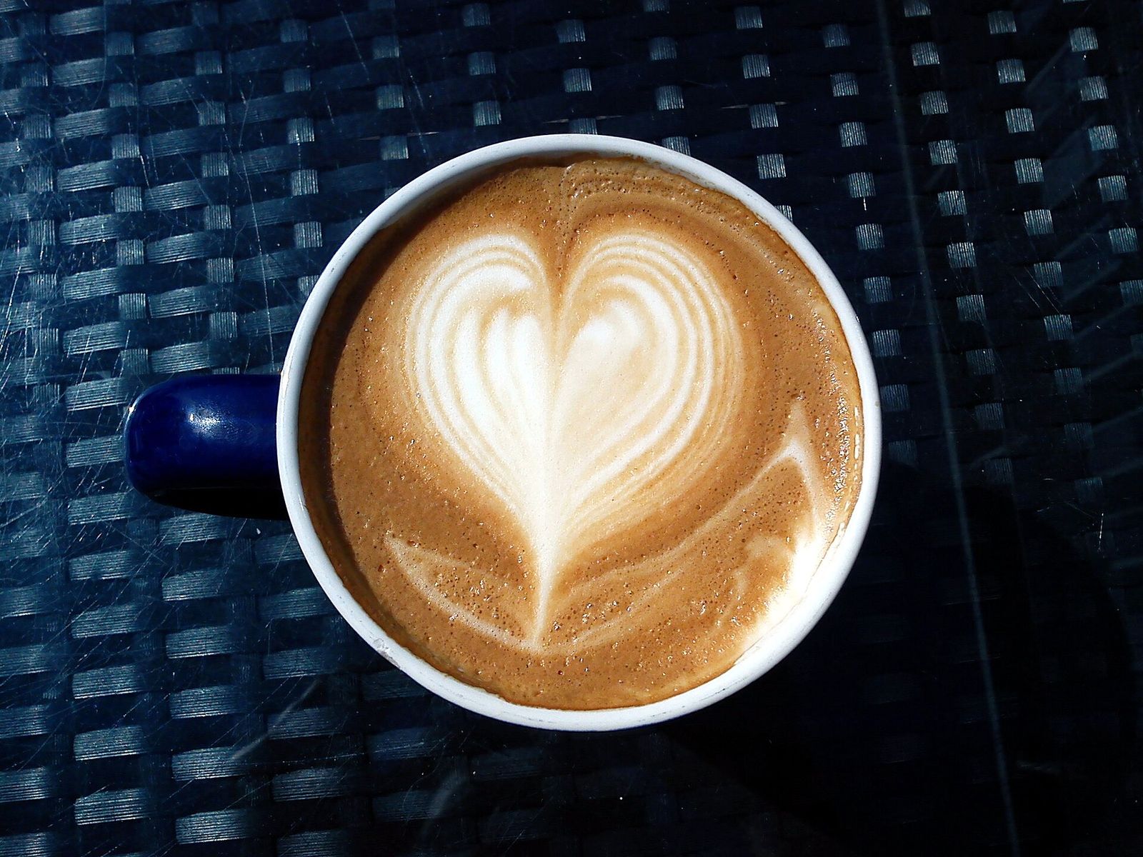
Research on logos says a café nobody knows yet should show what it sells. Here are ten ways to do that, from a steaming mug to a moka pot, each a finished mark built from lines and circles on a grid, with the drafts that went wrong along the way.
Most coffee shop logo advice stops at “use a cup or a bean”. That’s a fair start, but a café’s logo has a hard job. It has to work on a paper cup, a rubber stamp on a kraft bag, the shop window and a profile picture the size of a fingernail, and it has to tell a stranger walking past that you sell coffee.
We make EasyLogo, a logo maker that draws with straight lines and circles between the dots of a grid, so every idea below is a finished mark rather than a mood board. For each one you get the idea, what makes it work, who it suits and the settings to redraw it. First, what the research says a new café’s logo should do.





What makes a good coffee shop logo?
It shows coffee, especially while nobody knows you
Marketing researchers call a logo descriptive when its words or pictures show what kind of product the brand sells. Across six studies, Luffarelli, Mukesh and Mahmood found that more descriptive logos improved how people rated a brand and how likely they were to buy, and in 423 listed consumer brands they went with higher sales. Descriptive logos are easier to take in, which made the brands seem more authentic. The boost was much weaker for brands people already knew, and it reversed for products people feel negatively about.
Their own example is coffee. The Costa Coffee logo has coffee beans and the word “coffee” in it; the Starbucks logo has neither. A famous chain can afford an abstract mark; a café that opened last month can’t, because nobody has learned what it means yet. Across the 597 brands in two of their samples, only 41 percent of logos were descriptive, which the authors read as a benefit many brands miss.
Round feels soft, angular feels tough
In five experiments, Jiang, Gorn, Galli and Chattopadhyay found that circular logos call up softness and angular ones hardness. In the first, 109 students saw an ad for a sports shoe. With a circular logo, they rated it more comfortable (6.50 on a 9-point scale, against 5.35 with an angular logo and 5.47 with none). With the angular logo they rated it more durable (6.27, against 5.39 and 5.51). In a later experiment, round shapes made people expect an airline to be more understanding with a customer, at least among people who tend to think in pictures. The effect disappeared when an ad’s headline pointed at a different quality, so a logo nudges rather than decides.
For a café, that’s a vote for circles; straight, faceted marks read tougher, which can suit a roastery.
A tilt adds energy
Luffarelli, Stamatogiannakis and Yang found that asymmetrical logos are more arousing, so people see them as more exciting. That lifted evaluations of brands with an exciting personality, and the authors found the effect for excitement alone. We’d give a tilted mark to a loud roaster with a neon sign and a level, symmetrical one to a quiet corner café.
It survives small sizes and one colour
Your logo will spend much of its life small, on a map listing, a browser tab or a round profile picture, and much of it in one colour. We checked every mark below at 32 pixels and in a single ink, and one draft only worked because of its colours. More on that below.
10 coffee shop logo ideas, drawn on a grid
Every mark is built from straight lines and full circles between dots, a constraint that forces simple shapes. A “drag” is one pen stroke through several dots; a circle is drawn between two dots that become the ends of its diameter.
| # | Idea | Best for | Grid | Built from |
|---|---|---|---|---|
| 1 | Steaming mug | A neighbourhood café | 11 × 11 | 5 drags |
| 2 | Cup and saucer from above | A sit-down café | 11 × 11 | 2 circles, 1 drag |
| 3 | Latte art heart | An espresso bar proud of its milk | 11 × 11 | 1 circle, 1 drag |
| 4 | Faceted bean | A roaster, or anywhere selling beans | 9 × 9 | 2 drags |
| 5 | Coffee cherries | A roaster that talks about farms | 9 × 9 | 2 circles, 1 drag |
| 6 | Moka pot | Italian-style espresso | 11 × 11 | 1 circle, 4 drags |
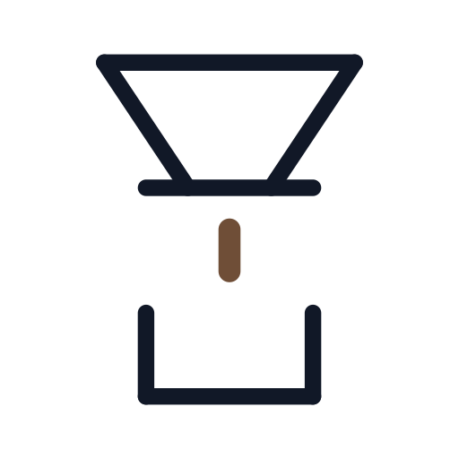
| 7 | Pour-over cone | A slow bar or filter specialist | 11 × 11 | 4 drags |
| 8 | Takeaway cup | Grab-and-go counters and kiosks | 11 × 11 | 3 drags |
| 9 | An initial in the steam | A name that starts with S | 11 × 11 | 4 drags |
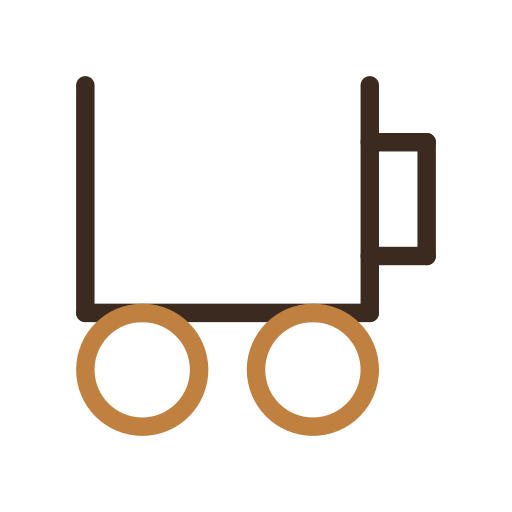
| 10 | Mug on wheels | A coffee cart, bike or van | 9 × 9 | 2 circles, 2 drags |
1. The steaming mug
The most descriptive coffee shop logo there is. The steam does the work: without it you have a cup, with it you have hot coffee. The mug is one drag (down, across, up), the handle is another, and the steam is three short strokes, the middle one taller. Brown for the mug and caramel for the steam, stroke 20, round caps.
Our first steam was two identical zigzags side by side. At a glance they read as a pair of angular letters, and a single zigzag looked like a code bracket. Straight wisps of uneven height read as steam and as nothing else.
2. The cup and saucer from above
Seen from above, a cup and saucer are two circles with a shared centre. The handle is what stops them reading as a target, so it’s the one detail you can’t drop. To keep circles concentric, draw each between two dots the same distance either side of the centre dot. The saucer is a lighter brown at stroke 14 against 20 for the cup, so it sits back.
This one suits a café where people stay. That’s an old idea: the 16th-century coffee houses of the Middle East, the qahveh khaneh, were known as “Schools of the Wise”, and England’s later coffee houses were nicknamed “penny universities”.
3. The latte art heart
Latte art says the milk is done properly, and the heart is the pattern to draw: Perfect Daily Grind calls it the first latte art most people learn to pour. Our heart is one drag of ten straight segments with square shoulders, inside a single ring for the cup.
The milk is caramel rather than white because a white stroke vanishes on a white background. The first heart had a flat top and a shallow notch and looked like a cut gem; making the sides vertical before they turn in made it a heart.
4. The faceted bean
A grid can’t draw an oval, so this bean is an eight-sided outline tilted 45 degrees, with a crease that kinks sideways halfway, like an S drawn with a ruler. Upright, our first octagon read as a luggage tag or a gem; tilted, it read as a bean. The tilt also makes it asymmetric, which the research above links with excitement, so it suits a roaster more than a quiet café.
5. Coffee cherries
Coffee beans are the seeds of a fruit the trade calls a cherry. According to the National Coffee Association, most coffee cherries hold two beans, while about 5 percent hold one, called a peaberry. The skin ripens from green to yellow to red, and the cherries grow along the branches.
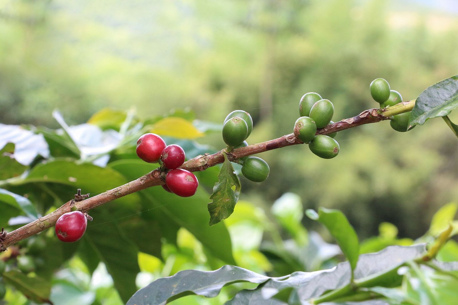
This idea took the most attempts. The classic two-cherry icon, with the stems meeting in a pointed leaf, looked fine in red and green but read as scissors in one ink. Three berries under two leaves read as Christmas holly, and a twig version looked like a pram. What survived is the simplest: two crimson rings on a brown upside-down V, with nothing past the point where the stems meet.
Most people will read “cherries”, not “coffee”, so it’s the least descriptive idea here. It works for a roaster that talks about farms, next to a name that has “coffee” in it.
6. The moka pot
The Moka Express began as Alfonso Bialetti’s idea in 1933, and Bialetti still makes it, octagonal aluminium boiler and all. It sits in the permanent collections of the Triennale di Milano and MoMA in New York. Other makers’ stovetop pots share the pinched waist, so the silhouette reads as a coffee pot even to people who don’t know the brand.
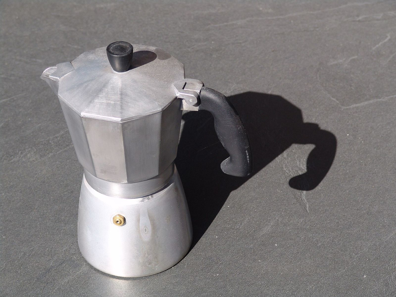
Without its details, a moka pot is an hourglass. The spout, the handle and the knob on the lid are what make it a coffee pot, so keep all three even at small sizes. Ours is grey for the aluminium and near-black for the handle and knob, as on the real thing.
7. The pour-over cone
Pour-over is coffee made by hand-pouring water over grounds in a filter, as the National Coffee Association puts it. Melitta Bentz registered a coffee filter with the German patent office in June 1908, after experimenting with a perforated brass cup and blotting paper from an exercise book.
The mark is a stack: a cone with a wide rim, the base plate it rests on, one drop and the cup. The drop is a short line with round caps, not a circle, because a small circle can only be drawn as a ring, and at small sizes a ring reads as a bubble.
8. The takeaway cup
Where most coffee leaves in a paper cup, show the paper cup. The taper makes it a cup: our sides narrow by one dot over seven rows, and a wider first version read as a bin. The sleeve is one caramel stroke at the maximum width of 30 with flat ends, so it stops square and sticks out past the sides, as a real sleeve does.
9. An initial in the steam
Steam already curls, so let it spell something. An angular S, drawn as one drag of six segments, rises from a small cup on a saucer line. It works best with letters that already wiggle, such as S, Z, N, M and W. Other letters work better as a monogram that shares strokes, and our monogram logo guide shows how.
10. The mug on wheels
Coffee carts, bikes and vans need a mark that says both coffee and moving. Circles make natural wheels, so this is the plainest possible twist: a mug like the one in idea 1, minus the steam, on two wheels. It stays descriptive, because the mug says coffee, and becomes yours, because nobody else’s mug has wheels.
How to test a coffee shop logo before you print it
- Shrink it to 32 pixels. If it turns to mush, cut detail or thicken the strokes. Our main strokes are 16 to 20 on a 500-pixel drawing canvas, about 1 to 1.3 pixels at 32 pixels wide, which was about the thinnest that still looked solid in our tests. Every size you’ll need is in our logo sizes cheat sheet, including how a circular crop treats a square logo.
- Print it in one colour. Stamps, sleeves and window vinyl often print in one ink, and colour can hide a weak shape, as the cherries showed.
- Keep a vector master. Order cups and signs from an SVG and use PNGs for the web; our SVG vs PNG guide explains why.
- Add a frame only when it has a job. In six experiments, Fajardo, Zhang and Tsiros found that a frame around a logo raised purchase intent when buying felt risky (it read as protection) and lowered it when buying felt safe (it read as confinement). A flat white is about as safe as purchases get, so we’d draw a ring only for a reason, such as fitting a round stamp.
- Set up your map listing. Google shows a logo on a Business Profile only when the profile has a name, a valid street address, categories, a phone number and opening hours. It recommends images of 720 × 720 pixels, with a minimum of 250 × 250.
- Search the trademark register. In the United States that’s the USPTO’s trademark search. Logos are filed under six-digit design search codes and the system can’t search by image, so search the codes for cups or beans as well as your café’s name.
Coffee shop logo FAQ
What should a coffee shop logo include?
One recognizable coffee object, one twist that makes it yours, and your name next to it. A new café gains the most from a mark that shows what it sells, because nobody knows the name yet. Keep it to a handful of strokes: every mark above is five pen strokes or fewer, counting each circle as one.
What colours work for a coffee shop logo?
Pick one dark colour that holds up on white cups and brown kraft, then at most one accent. Ours use roast browns, with caramel, crimson or burnt orange as the accent. Whatever you choose, make sure the logo still reads in the dark colour alone.
Can I design my coffee shop logo myself?
Yes, if you test honestly: draw on a grid, keep to a few strokes, check it at 32 pixels and in one colour, show it to people who don’t know what it is, and search the trademark register before you print. Our minimalist logo guide takes one mark through every step.
How we made these
Every logo was drawn in EasyLogo’s free web editor by a script that drives the real page in a browser, dragging from dot to dot as a person would, and saving the editor’s own PNG and SVG exports. We checked each mark at 1024, 64 and 32 pixels and in a single ink, and redrew the ones that failed. One idea didn’t survive at all: a bistro chair, whose round back on a post above the seat read as a stick figure sitting down. The final SVGs range from 518 bytes (the cup and saucer) to 2.1 KB (the moka pot), and you can redraw any of them in the same editor with the grid sizes in the table.
The research findings come from the full text of the shape and descriptive-logo studies and the published abstracts of the asymmetry and frame studies. Coffee facts come from the National Coffee Association, Bialetti, the German Patent and Trade Mark Office and Perfect Daily Grind, and platform rules from Google’s and the USPTO’s own pages. The photos are from Wikimedia Commons.
References
- Luffarelli J, Mukesh M, Mahmood A. Let the Logo Do the Talking: The Influence of Logo Descriptiveness on Brand Equity. Journal of Marketing Research. 2019;56(5):862-878.
- Jiang Y, Gorn GJ, Galli M, Chattopadhyay A. Does Your Company Have the Right Logo? How and Why Circular- and Angular-Logo Shapes Influence Brand Attribute Judgments. Journal of Consumer Research. 2016;42(5):709-726.
- Luffarelli J, Stamatogiannakis A, Yang H. The Visual Asymmetry Effect: An Interplay of Logo Design and Brand Personality on Brand Equity. Journal of Marketing Research. 2019;56(1):89-103.
- Fajardo TM, Zhang J, Tsiros M. The Contingent Nature of the Symbolic Associations of Visual Design Elements: The Case of Brand Logo Frames. Journal of Consumer Research. 2016;43(4):549-566.
- National Coffee Association. What is coffee?
- National Coffee Association. History of coffee
- National Coffee Association. Pour-over coffee
- Bialetti. Moka Express
- German Patent and Trade Mark Office (DPMA). Melitta Bentz’s coffee filters
- Lee J. Heart and Soul: A VIDEO Guide to Pouring Your First Latte Art. Perfect Daily Grind, 18 July 2016.
- Google Business Profile Help. Manage your Business Profile photos & videos
- USPTO. Search our trademark database and Design search codes
Image credits
- A caffe latte with a heart poured in the milk, seen from above · Photo: cyclonebill from Copenhagen, Denmark, CC BY-SA 2.0 (Resized)
- Coffee berries in Hacienda Guayabal, Caldas Department, Colombia · Photo: Bernard Gagnon, CC BY-SA 4.0 (Resized)
- An aluminium stovetop moka pot · Photo: Bigbratze, CC BY-SA 4.0 (Resized)