 Haplo
Haplo
How to Design a Minimalist Logo
We take one made-up logo from a short brief to finished files and show every stage: the ideas that lost, the passes that cut it down, and the moment it turned into a letter.
A minimalist logo is a mark cut down to the few shapes that carry one idea. It has to work on a shop sign and at 16 pixels in a browser tab, in colour and on a black-and-white photocopy. Getting there is mostly editing: a short run of decisions, each one easy to test.
This guide follows one logo from a one-paragraph brief to its final files and shows it at every stage, including the versions that didn’t work. The client is made up: a piano teacher who teaches beginners at home. We make EasyLogo, a logo maker built on a grid of dots, and drew every logo here in it; the free web version is all you need to follow along.
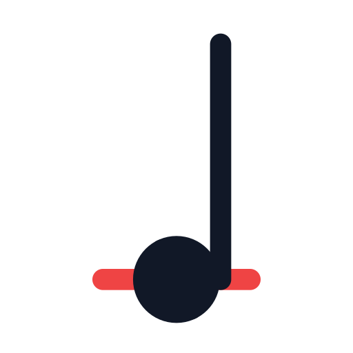
Here’s where it ends up: a solid note head, its stem and one short red line.
What makes a logo minimalist?
Apple’s app icon guidelines sum it up. Simple icons “tend to be easiest for people to understand and recognize”, and fine details “may be hard to discern at smaller sizes”. So find the concept that captures the essence of the thing and express it “in a simple, unique way with a minimal number of shapes.”
In practice that means one idea to recognise rather than several to decode, a handful of shapes in one line weight, nothing that vanishes when it’s small, and a version in a single colour.
How to design a minimalist logo, step by step
1. Write a one-paragraph brief
Write down who the logo is for, what it should say and everywhere it will appear. The places set the hard limits: the smallest size and the worst printing it will ever get. Ours:
A piano teacher who teaches children and adult beginners from home. The logo goes on a flyer that gets photocopied in black and white, a website, WhatsApp and Instagram profile pictures, and stickers for music books. It should feel friendly and calm, not like a concert hall.
Two limits fall out of that. The website needs a favicon, the icon in a browser tab, which is usually 16 × 16 pixels. And the photocopy means the logo has to work in one colour.
2. Find one idea
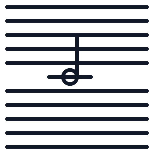
List the words the business suggests, then sketch fast, without judging. Our list: keys, notes, practice, metronome, patience, first lessons, home. Four of the sketches:
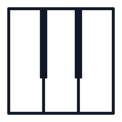
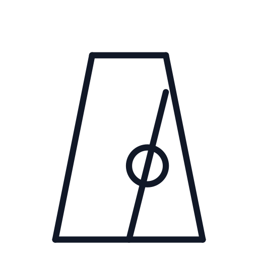
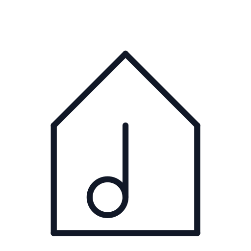
Keys are the obvious first sketch, which is their problem: obvious ideas are the ones other people have had too. The metronome says practice, the chore rather than the reward. The house needs two symbols to say one thing.
The fourth is middle C, the fourth C from the left on a standard 88-key piano. It’s written on a short line of its own, a ledger line, just below the treble staff or just above the bass staff, so on a grand staff it sits between the two. It belongs to piano teaching, and people who can’t read music still see a note.
Should a logo describe the business at all? The designer Paul Rand wrote in 1991 that “a logo is rarely a description of a business”. That holds for names people already know. For new ones, the research leans the other way: across six studies, Luffarelli, Mukesh and Mahmood found that more descriptive logos, ones that hint at what the brand sells, improved brand evaluations and purchase intentions, because they were easier to process and felt more authentic. The effect was much weaker for brands people already knew. A piano teacher nobody has heard of yet is the case where a hint helps.
3. Build it on a grid
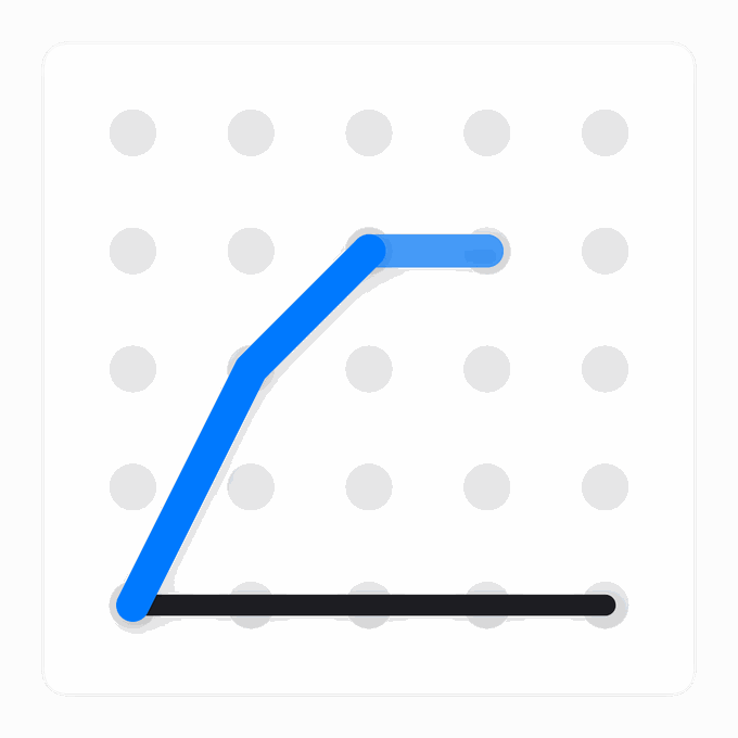
Redraw the idea on a grid, and it makes decisions for you: lines start and end on dots, angles come from a short list, and repeated sizes match. IBM draws its interface icons on a 32 × 32 pixel grid that it calls “the underlying fabric of all IBM icons”, and asks for one line weight per icon: “A single icon shouldn’t contain a mix of different stroke weights.”
Use the coarsest grid that holds the idea. Our first sketches used 7 × 7 dots and the grand staff 11 × 11; the note from here on uses 12 × 12, which allows smaller circles.
4. Reduce it in passes
The grand staff is accurate and far too busy. At 16 pixels its ten staff lines merge into a grey block. Remove whole elements, one pass at a time, and after each pass ask whether the idea survived.
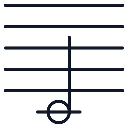
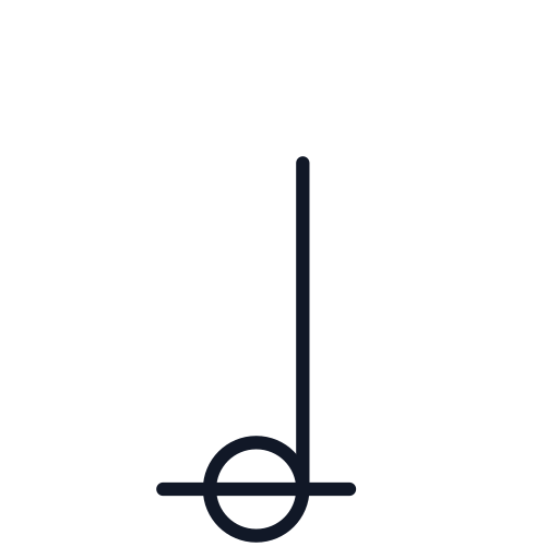
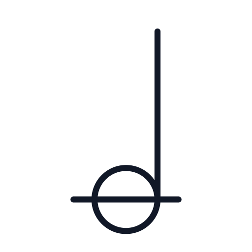
Pass 1 drops the bass staff. Pass 2 drops the treble staff too, and the idea survives, because the short line through the note is what makes it middle C. But the note was sized to fit between staff lines that are gone, so now it’s small and stranded. Pass 3 makes it bigger and centres it: the head grows from two grid spaces across to three, and the ledger line reaches one space past it on each side.
What we didn’t do was shrink, thin or fade the staff lines. Half-removing a detail keeps the clutter and loses the clarity.
5. Make it hold up at 32 and 16 pixels
Pass 3 looks fine at this size. Shrink it and it falls apart, because line weight shrinks with everything else. Here’s how wide a line ends up, by its thickness as a share of the logo’s width:
| Line thickness (share of width) | 512 px | 128 px | 64 px | 32 px | 16 px |
|---|---|---|---|---|---|
| 2.4% | 12.3 px | 3.1 px | 1.5 px | 0.8 px | 0.4 px |
| 6% | 30.7 px | 7.7 px | 3.8 px | 1.9 px | 1.0 px |
Below one pixel, a line can only be drawn as a faint smudge. Apple’s guidelines say to “avoid extremely thin line weights and sharp corners, because they tend to lose detail and crispness in smaller icon sizes at lower resolutions.” Google’s Material Symbols icons change their line weight with their size for the same reason: “for the image to look the same at different sizes, the stroke weight (thickness) changes as the icon size scales.”
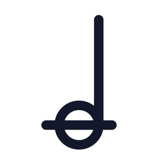
A logo can’t adjust itself, so build the weight in. IBM’s 2-pixel stroke on a 32-pixel icon is 6.25 percent of the width, a good benchmark. We took our lines from 2.4 to 6 percent:
Then test the real thing: export it, shrink it to 32 and 16 pixels, and look at it at actual size on a phone, next to other icons. If you can still tell what it is, it passes.
6. Check what else it looks like
The heavier lines exposed a problem. A hollow circle with a stem on its right is how geometric typefaces draw a lowercase d, and a bar through it makes a real letter: đ, “Latin small letter d with stroke”, used in Croatian, Serbian and Vietnamese among other languages. The Unicode code chart even notes “an alternate glyph with the stroke through the bowl”, which is exactly what our draft had become.
Simple shapes are shared by letters, signs and other logos, so every simple mark risks an accidental reading. Look at yours upside down and mirrored, show it to someone for two seconds and ask what they saw, and check it small, where only the silhouette is left.
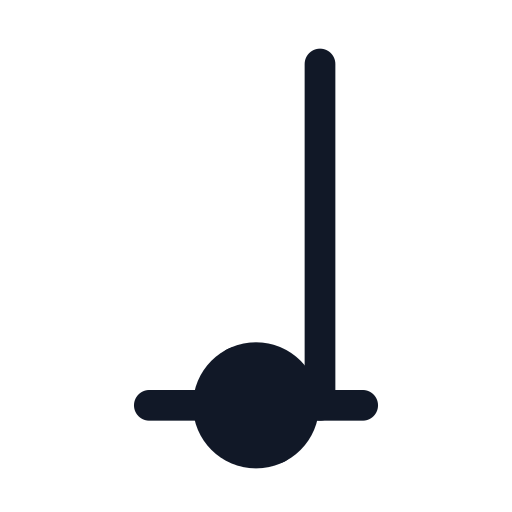
The fix was to fill the note head. A solid head on a stem is the note shape people know from sheet music, and it reads as a note first.
7. Finish the ends and corners
Now look at where each line ends. SVG, the format most logos end up in, defines three kinds of line end: a butt end stops flat at the endpoint, a round end adds a half circle as wide as the line, and a square end adds a rectangle half as long as the line is wide, so the line comes out longer.
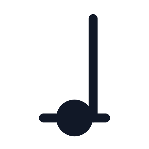
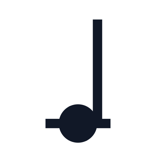
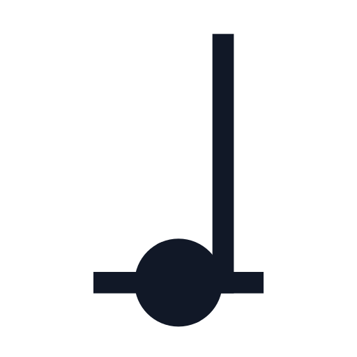

Round ends feel friendlier and butt ends more precise. Square ends look like butt ends but stretch every line by half its thickness, which can upset spacing you set on the grid. At a corner drawn as two separate strokes, butt ends leave a notch, while round or square ends fill it.
We kept round ends, since the brief asks for friendly and calm, and choices like this do register. In five experiments, Jiang and colleagues found that circular logo shapes call up softness and angular ones hardness: a sports shoe with a circular logo was judged more comfortable, and with an angular one more durable. Another set of studies found asymmetric logos more arousing than symmetrical ones, which suited brands with an exciting personality. Treat findings like these as nudges, not rules.
8. Add colour last
The logo has to work in one colour anyway, and colour is the easiest thing to argue about, so settle the shape first.
Then check contrast. The web’s accessibility guidelines ask for a contrast ratio of at least 3:1 for graphics people need to see. Logos are largely exempt, and text in a logo has no contrast requirement, but a mark people can’t see isn’t doing its job. Here’s how eleven common colours measure, using the WCAG 2.1 formula:
| Colour | Hex | On white | On near-black |
|---|---|---|---|
| Near-black | #111827 | 17.74:1 | 1.00:1 |
| Dark grey | #374151 | 10.31:1 | 1.72:1 |
| Violet | #7c3aed | 5.70:1 | 3.11:1 |
| Mid grey | #6b7280 | 4.83:1 | 3.67:1 |
| Red | #ef4444 | 3.76:1 | 4.71:1 |
| Blue | #3b82f6 | 3.68:1 | 4.82:1 |
| Pink | #ec4899 | 3.53:1 | 5.03:1 |
| Lavender | #a78bfa | 2.72:1 | 6.52:1 |
| Light pink | #f472b6 | 2.65:1 | 6.70:1 |
| Green | #10b981 | 2.54:1 | 6.99:1 |
| Amber | #f59e0b | 2.15:1 | 8.26:1 |
Amber fails on white at 2.15:1 but does well on a dark background, so it could only work in a reversed version. Violet passes on both, the dark side only just. Mid grey, red, blue and pink clear 3:1 on both.
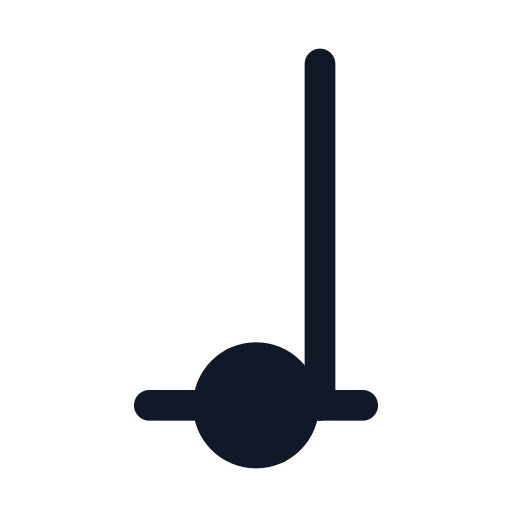
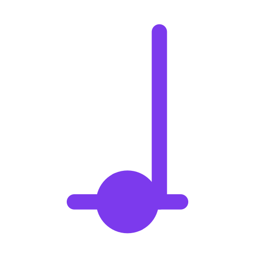
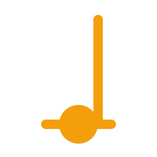
Don’t let colour carry the idea alone, either. About 1 in 12 men have a colour vision deficiency, and the most common type makes red and green hard to tell apart. Our final version is ink with a red ledger line (3.76:1 on white), but the red only decorates a line that’s already there. For dark backgrounds, make a reversed version: the ink turns white and the red stays.
9. Check it isn’t taken
Simple marks are easy to reinvent by accident, so search before you print anything. The USPTO says one of the most common reasons trademark applications are rejected is a likelihood of confusion with a registered mark, and its examiners check only the federal database; state databases and the internet are up to you. Its search system currently doesn’t allow reverse image searching, so logos are found through six-digit design codes that describe what a design contains. Beyond the US, WIPO’s Global Brand Database covers trademarks under the Madrid System and from participating national and regional offices, and it can search by image similarity.
A search isn’t legal clearance. Before you spend real money on signs or stock, an hour with a trademark lawyer is worth it.
10. Export the files you’ll need
Keep a master copy as an SVG, which can be rendered at any size without loss of quality, and export PNGs where pixels are wanted. You’ll usually want a transparent background, a one-colour version, a reversed version, and a square version with room around the mark so a circular crop doesn’t clip it. Our logo sizes cheat sheet lists the sizes each platform asks for, and SVG vs PNG covers which file goes where.
If you set the business name beside the mark, pick a plain typeface whose weight matches the lines, and check the licence. Fonts under the SIL Open Font License are fine: asked whether the fonts can be used to create logos, the licence’s FAQ answers “Yes. You are very welcome to do so.”
Minimalist logo FAQ
How many colours should a minimalist logo have?
One or two, and it must work in one. Start in black, and add a colour only if it earns its place and passes a contrast check.
How thick should the lines in a logo be?
Thick enough for the smallest size you need. Lines about 6 percent of the logo’s width stay close to 2 pixels wide at 32 px, in line with IBM’s 2-pixel stroke on its 32-pixel icons.
Should a minimalist logo include the business name?
Keep the mark and the name as separate pieces that also work together: the mark alone for favicons and profile pictures, the pair on signs and flyers. To build a mark from initials, see our monogram logo ideas, and for ten more worked marks, our coffee shop logo ideas.
How we made this
Every logo here was drawn in EasyLogo’s free web editor with its lines and circles: the first sketches and the corner test on 7 × 7 and 11 × 11 grids, and the note from pass 1 on 12 × 12. Line weights are the editor’s pixels on its canvas, which is up to 500 pixels wide; 12 is the default, and 30, the slider’s maximum, is the 6 percent in step 5. The editor draws circles as outlines, so the solid note head is two circles on one centre, drawn 30 pixels thick so their bands overlap, plus a short line to close the pinhole in the middle. The contrast table uses the editor’s quick palette, minus white; we computed the ratios with the WCAG 2.1 formula and the line widths from the canvas size. The piano teacher is made up. Research findings come from each paper’s abstract or full text, and the photos are from Wikimedia Commons.
References
- Apple. App icons. Human Interface Guidelines.
- IBM Design Language. UI icons: Design.
- Google Fonts. Material Symbols guide.
- MDN Web Docs. Favicon.
- MDN Web Docs. SVG: Scalable Vector Graphics.
- MDN Web Docs. stroke-linecap.
- W3C. Understanding Success Criterion 1.4.11: Non-text Contrast.
- W3C. Understanding Success Criterion 1.4.3: Contrast (Minimum).
- W3C. Web Content Accessibility Guidelines (WCAG) 2.1: definitions of contrast ratio and relative luminance.
- National Eye Institute. Color Blindness.
- Rand P. Logos, Flags, and Escutcheons. 1991.
- Luffarelli J, Mukesh M, Mahmood A. Let the Logo Do the Talking: The Influence of Logo Descriptiveness on Brand Equity. Journal of Marketing Research. 2019;56(5):862-878.
- Jiang Y, Gorn GJ, Galli M, Chattopadhyay A. Does Your Company Have the Right Logo? How and Why Circular- and Angular-Logo Shapes Influence Brand Attribute Judgments. Journal of Consumer Research. 2016;42(5):709-726.
- Luffarelli J, Stamatogiannakis A, Yang H. The Visual Asymmetry Effect: An Interplay of Logo Design and Brand Personality on Brand Equity. Journal of Marketing Research. 2019;56(1):89-103.
- USPTO. Why search for similar trademarks.
- USPTO. Design search codes.
- WIPO. Global Brand Database.
- SIL. OFL FAQ.
- Music Theory Academy. Middle C.
- Unicode Consortium. Latin Extended-A code chart.
Image credits
- White-painted pegboard with evenly spaced round holes · Photo: M0tty, CC BY-SA 3.0 (Resized)
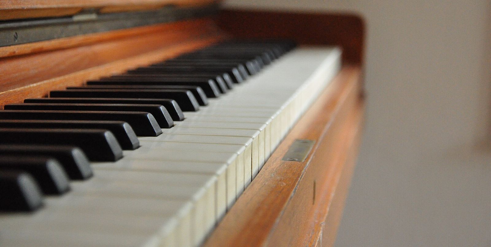
- Close-up of the keys of an upright piano · Photo: Puikstekend, CC BY-SA 4.0 (Cropped and resized)