 Haplo
Haplo
Monogram Logo Ideas
Nine two-letter marks built from straight lines and circles on a grid, the one rule that decides which letters can share a stroke, and the three ways a monogram turns back into one letter, a word or an icon.
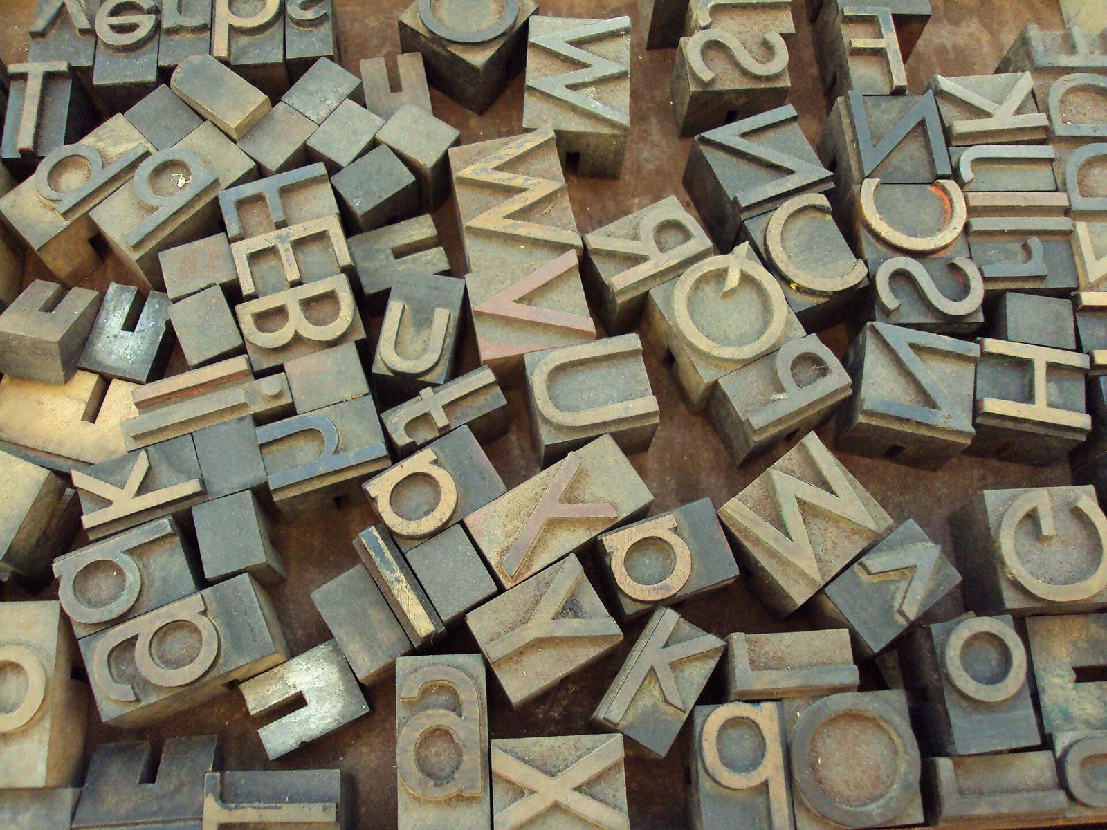
A monogram is initials made into one mark. The Cambridge Dictionary calls it “a symbol, usually formed from the first letters of a person’s names joined together”, and the joining is where all the design happens. Set two letters side by side and you have initials. Let them share a stroke and you have one shape, which holds together as a favicon, on a rubber stamp or stitched on a cuff.
Below: the rule that decides whether two letters can share a stroke, nine monogram logo ideas that join their pairs in seven different ways, and three mistakes that turn a monogram back into one letter, a word or an icon. We make EasyLogo, a logo maker built on a grid of dots, and drew every mark here in it from straight lines and circles, so you can redraw any of them dot for dot in its free web editor.
How two letters share a stroke
Take an H and a K. The H ends on the right with an upright stem, and the K starts on the left with one. Move them together until those two stems land on each other, and the pair becomes a single mark that still reads HK.
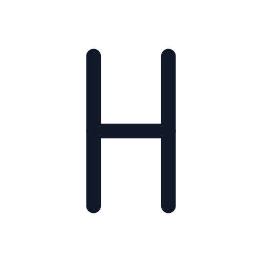
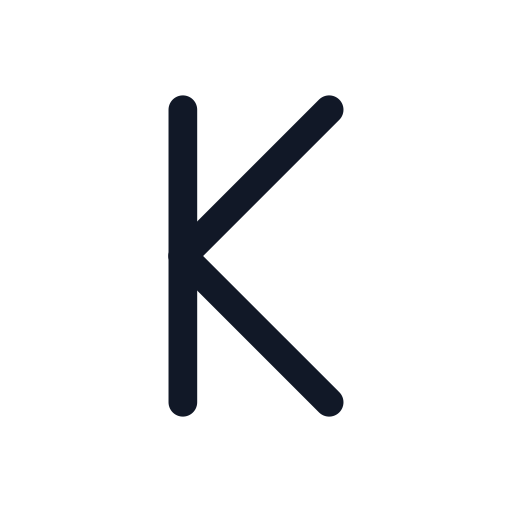

That’s the whole rule: look at the right edge of the first letter and the left edge of the second. If both are the same kind of stroke, running the same way, the letters can share it. If they aren’t, the letters can still touch at one point, as in the Œ below, or one can tuck under the other, as the To below does.
What you shouldn’t give away is the ends. When psychologists mapped which parts of Arial letters people rely on to identify them, line terminations came out as the most important features, for capitals and lowercase alike. A terminal is simply the end of a stroke. So the middle of a monogram can be shared or merged, as long as each letter keeps its ends where a reader expects them. The K in HK has lost its own stem, but its arm tips and both ends of the borrowed stem are still there.
Which letters can share a stroke?
This is our map of the capitals and common lowercase letters, sorted by the stroke on each side. A pair can share a stroke when the first letter has it on its right side and the second has it on its left.
| Stroke | On the right side of | On the left side of | Pairs to try |
|---|---|---|---|
| Upright stem | H, J, M, N, U; a, d, h, m, n, q, u | B, D, E, F, H, K, L, M, N, P, R, U; b, h, k, l, m, n, p, r, u | HK, JR, NB, MP, db |
| Diagonal, top left to bottom right | A | V, W | AV, AW |
| Diagonal, bottom left to top right | V, W | A | VA, WA |
| Top bar | E, F, T, Z | E, F, T, Z | FT, TE, ZT |
| Baseline bar | E, L, Z | E, L, Z | EL, ZL |
Round sides are the exception: a circle can only touch a straight stroke at one point, and that point is enough, as the db and Πbelow show.
Monogram logo ideas, drawn on a grid
Each mark is drawn with straight lines between dots and circles whose diameter runs between two dots, all with round ends. We give the grid and stroke width for each (in pixels on a 500 px canvas) so you can redraw it. For picture marks rather than letters, see our coffee shop logo ideas.
1. Share a stem: HK and JR
The HK above is as plain as a monogram gets: the H’s right stem doubles as the K’s stem, and the K’s arms meet it exactly where the H’s crossbar arrives, so all the busy work happens at one junction. Grid 7 × 7, stroke 28.
JR goes further, because neither letter can be drawn the usual way. J has no straight form, so it gets a square hook. R’s bowl becomes a circle touching the shared stem, with the leg starting from the circle’s bottom. Both letters keep their ends: the J’s upturned tip, the R’s leg and the top of the stem.
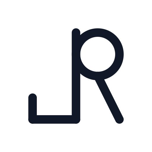
Grid 7 × 7, stroke 28. NB, MP and HR work the same way. Just don’t share with I or l: a letter that is only a stem has nothing left once it gives it away.
2. Share a diagonal: AV
An A ends on a diagonal running down to the right, and a V starts with one. Make them the same line and the pair becomes a zigzag of three strokes plus a crossbar, which is the only thing that makes the first peak an A. It sits halfway up: on this grid, the only height where both of the A’s legs pass through a dot.
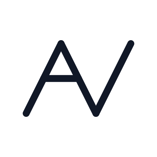
Grid 9 × 9, stroke 22. The same move works for AW, and reversed for VA and WA.
3. Share a crossbar or a baseline: EL
Horizontal bars are the easiest strokes to share, because a bar can simply keep going. Here the E’s bottom bar runs on under a small gap and becomes the L’s foot, so both letters stand on one line.
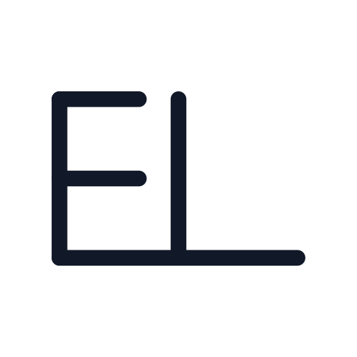
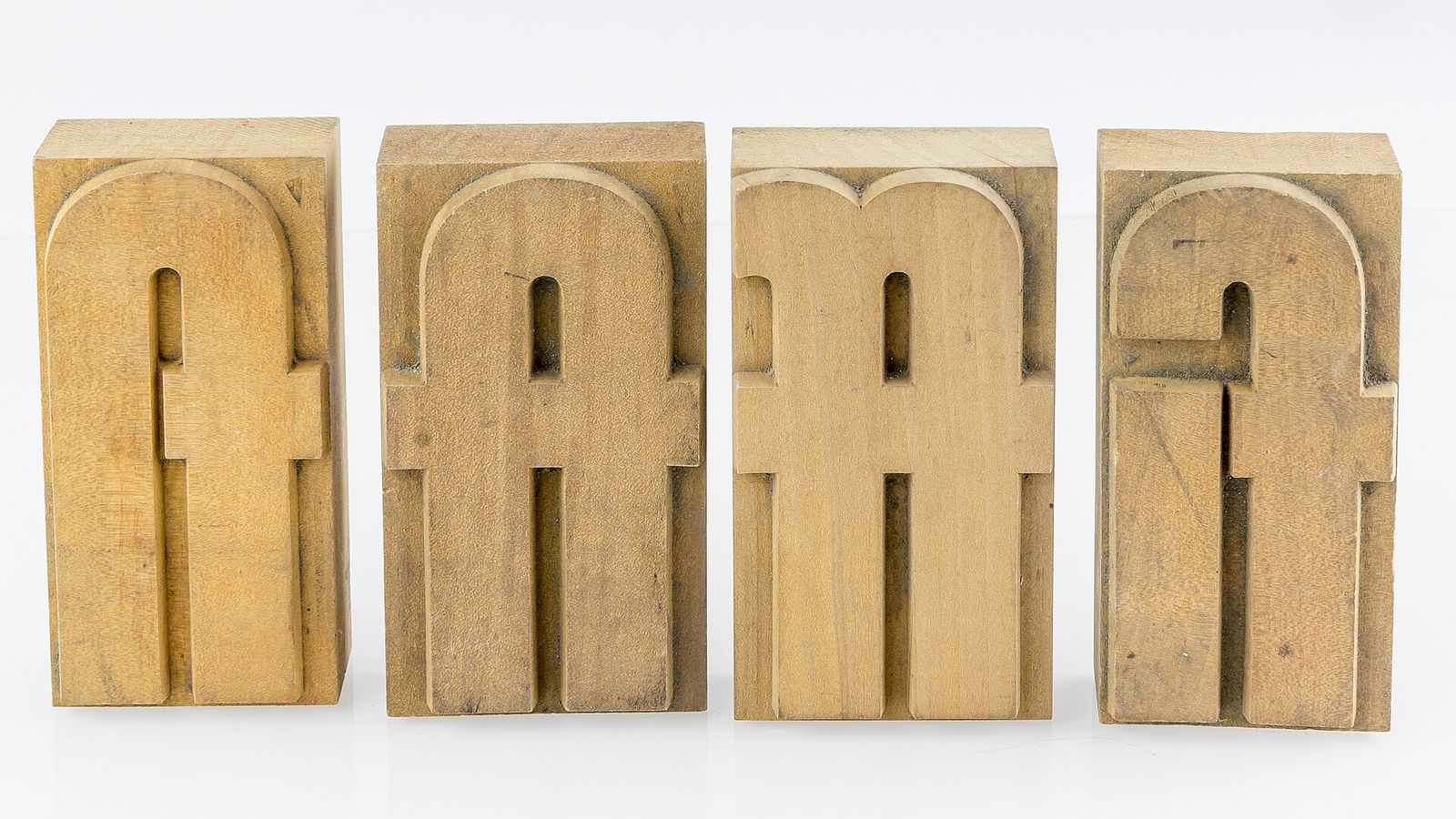
Grid 9 × 9, stroke 22. Type makers did the same with crossbars: in the wooden type below, ft and ff were each cut as one block with a single crossbar.
Top bars share just as well: try FT, TE or ZT. Watch the double T, though. Two Ts under one bar look like π.
4. Draw both letters in one line: NM
N and M share a stem, and their strokes line up so the whole pair draws without lifting: up, down to the right, up, down to the point of the M, up to the right, and down. That’s one drag through seven dots, and every diagonal runs at the same angle, which gives the mark an even rhythm.
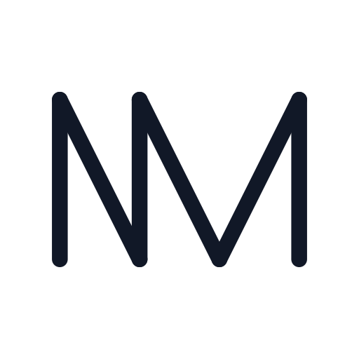
Grid 9 × 9, stroke 22. Order matters: try MN and you’ll have to go back over a stroke. NM draws in one go.
5. Mirror the pair around one stroke: db
A d and a b are mirror images, so they can share the stem between them: a circle on each side and the stem rising above both. The pair is symmetrical, so the mark even reads the same in a mirror.
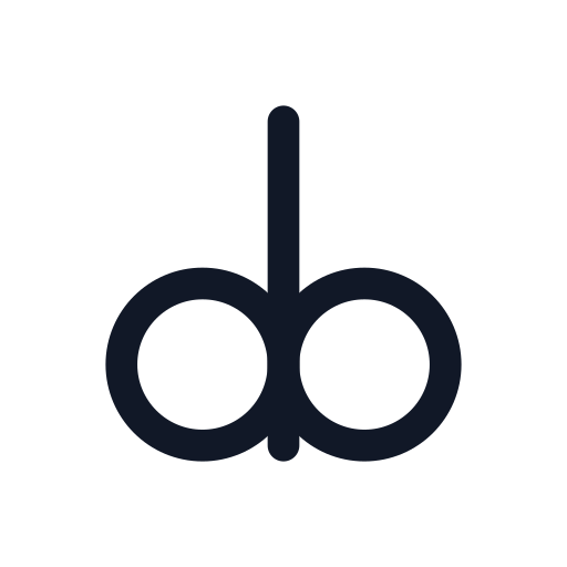
Grid 7 × 7, stroke 28. Hang the stem below the circles instead and the same mark becomes qp.
Round ends matter most in mixed marks like this. Round shapes look shorter than flat ones of the same height, which is why type designers let an o overshoot the baseline slightly. A grid can’t nudge a circle by a pixel, but a round-ended stem rises exactly as far past its last dot as a circle’s edge does, and both tops are curves, so neither looks short.
6. Tuck one letter under the other: To
Some pairs have no stroke to share, so they share space instead. A T leaves two empty corners under its bar, and a small o fits neatly under the right arm. The same works for any letter with an empty corner beside a partner that’s shorter: Lo, Fa, Vo, Ty.
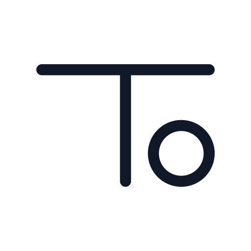
Grid 9 × 9, stroke 22. Keep the tucked letter big enough to survive being small. The space inside an o is its counter, and a small counter closes up as a mark shrinks, so we kept this circle two cells across.
7. Borrow a ligature that already exists: Æ and Œ
Merged letter pairs are old. A ligature is a single glyph that combines a sequence of characters, like the fi that keeps an f’s hook from hitting the dot of an i. The ampersand began as a ligature of e and t, Latin for “and”, and early examples turned up in the ruins of Pompeii.
Some ligatures became letters. Unicode lists æ as used in Danish, Norwegian, Icelandic, Faroese and Old English, and in Unicode 1.1 its capital was named “latin capital ligature ae”. Œ is still officially the Latin capital ligature OE. If your initials are AE or OE, the monogram is already designed.
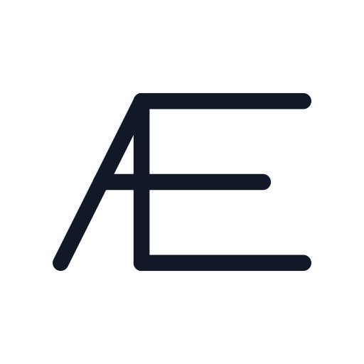
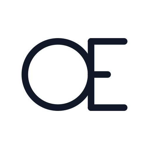
Grid 9 × 9, stroke 22 for both. In the Æ, the E’s spine stands in for the A’s right leg, the A’s apex becomes the E’s top corner, and the crossbar runs straight on as the E’s middle bar. In the Œ, the E’s spine touches the right side of a circle.
How to design a monogram logo from your initials
Our minimalist logo how-to covers the whole process. For a two-letter mark, this is the order we work in:
- Write the pair every way. Capitals, lowercase and both orders. JR and RJ are different problems, and lowercase often joins more easily because b, d, p and q are all built from a stem and a bowl.
- Check the edges. Find the right side of the first letter and the left side of the second in the table above. A match means you can share a stroke. No match means the letters touch at a point or one tucks under the other.
- Swap curves for what the grid has. Bowls (B, P, R, b, d, p, q) become circles. C, G, J, S and U have no full circle in them, so they go square, like the J in JR. S suffers most, since a square S is also a 5, so give it a partner that makes the reading obvious.
- Pick the grid. Letters four cells tall on a 7 × 7 grid leave a ring of empty dots around the mark as its margin. Use 9 × 9 when you need diagonals two cells wide, as in AV and NM.
- Set the weight for the smallest size. A 12 px stroke on a 500 px canvas shrinks to 0.77 px when the whole logo is shown at 32 px, which is less than a pixel. A 28 px stroke comes out at 1.8 px. Every mark here uses a stroke of about one tenth of its letter height. Apple’s app icon guidelines give the same warning: avoid extremely thin line weights and sharp corners, because they lose detail at small sizes.
- Test it small, in one colour, on a stranger. Shrink it to 32 px, print it in black, and show it to someone who doesn’t know your initials. Ask what it says, not whether they like it. If they read one letter, a word or an icon, see the next section.
- Search before you print. Two-letter marks are everywhere. The USPTO’s Trademark Search is free, and marks don’t have to be identical to be confusingly similar.
Three ways a monogram goes wrong
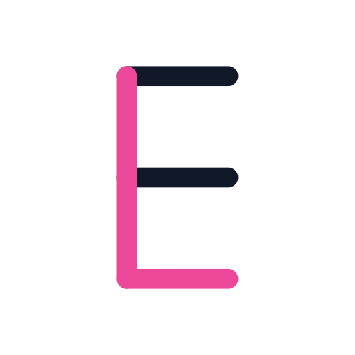
- One letter disappears into the other. Stack an E and an L on one stem and the L (in pink) is just the E’s spine and bottom bar. F vanishes into E the same way, P into R, O into Q, and I into any letter with a stem. Share one stroke, not all of them, as the EL above does.
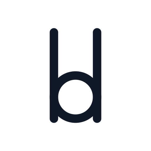
- The pair becomes a word. Let b and d share one bowl and you get a stem, a circle and a stem, which most people will read as “lol” before they read bd.
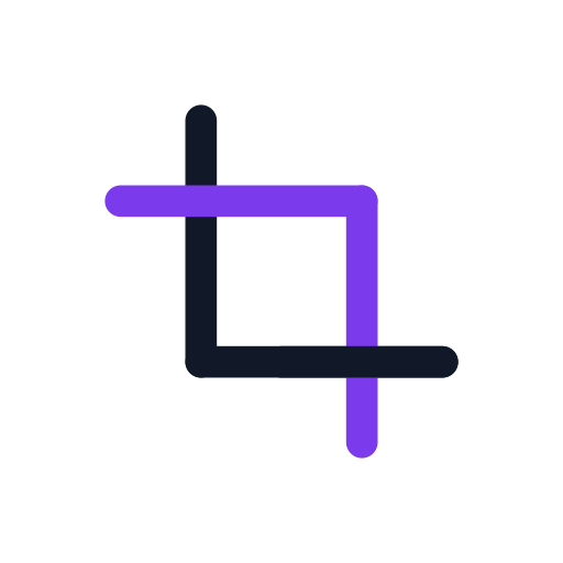
- The pair becomes an icon or a symbol. Two interlocked Ls make a tidy mark, and also something very close to the crop button in a photo editor. Letters in a ring carry the same risk: a capital R in a circle is ®, the symbol the USPTO tells owners to use once a trademark is registered. Ask whether your mark looks like anything on a phone screen, a road sign or a label.
Monogram logo FAQ
What is a monogram logo?
A logo made from initials joined into one shape, usually two or three letters. What separates it from initials typed in a font is the join: the letters share strokes, overlap or tuck into each other, so the mark works as a single symbol.
Which order should the initials go in?
For one person or one business, the order people say them. For a couple or two founders, either order is fine, so try both and keep the one that joins better. Joins aren’t symmetrical: NM draws in one line and MN doesn’t.
Which letters are hardest to monogram?
C, G, J, S and U, the letters built from open curves. A grid of lines and circles has no half circles, so they go square and need a partner that makes them readable. Letters with bowls are easier than they look: a circle touching a stem reads as a bowl.
What size should a monogram logo be?
Design it large, export it as a vector, and test it at the smallest size anyone will see it. Google’s favicon guidelines for Search ask for a square image at least 8 × 8 px and recommend one larger than 48 × 48. Our logo size cheat sheet lists the other sizes that matter, and SVG vs PNG covers which file to use where.
Should I check a monogram before I use it?
If it’s for a business, yes. The USPTO defines a trademark as “any word, phrase, symbol, design, or a combination of these things” that identifies your goods or services, which covers a monogram, and a mark only has to be similar, not identical, to conflict with one already used for related goods or services. This is general information, not legal advice.
How we made this
We drew every mark in EasyLogo’s free web editor with its only two tools: lines between dots (drag through several dots for a connected line) and circles whose diameter runs between two dots. Strokes are in pixels on the editor’s 500 px canvas, all with round ends, and the images were rendered by the editor itself from each mark’s dot positions. As SVGs, the finished marks range from 581 bytes (db) to 1,118 bytes (NM, whose one line exports as six segments). The small-size figures scale the 500 px canvas down to 32 px. The letter table is our own analysis; every other fact is linked where it appears, and the photos are from Wikimedia Commons.

References
- Cambridge Dictionary. Monogram. Cambridge Advanced Learner’s Dictionary & Thesaurus.
- Fiset D, Blais C, Éthier-Majcher C, Arguin M, Bub D, Gosselin F. Features for identification of uppercase and lowercase letters. Psychological Science. 2008;19(11):1161-1168.
- Google Fonts Knowledge, glossary: Ligature, Ampersand (&), Terminal, Counter and Overshoot.
- The Unicode Consortium. Code charts: C1 Controls and Latin-1 Supplement (Æ, æ) and Latin Extended-A (Œ, œ).
- Apple. Human Interface Guidelines: App icons.
- Google Search Central. Define website favicon for search results.
- United States Patent and Trademark Office. Trademark search, Likelihood of confusion and What is a trademark?
Image credits
- Wood letterpress type at Washington University in St. Louis · Photo: Michellecornelison, CC BY-SA 4.0 (Resized)
- Wooden movable types with ligatures · Photo: Raimond Spekking, CC BY-SA 4.0 (Resized)